
Link copied!
Moving Average Convergence Divergence (MACD)
MACD, or Moving Average Convergence Divergence, is a technical analysis indicator that helps traders identify both the direction of a trend and the strength of momentum by comparing short-term and long-term moving averages of a security’s price.
Key Takeaways
- Trend + Momentum Indicator: MACD helps identify both the direction of a trend and the strength of momentum by comparing short-term and long-term moving averages.
- Clear Trading Signals: Buy and sell signals are generated through crossovers, divergences, and histogram movements, making it visually straightforward to interpret.
- Best with Confirmation: MACD works best when used with other indicators like RSI, ADX, or volume analysis to avoid false signals, especially in sideways or choppy markets.
- Versatile Across Markets: MACD can be applied across equities, commodities, forex, and indices, and works on multiple timeframes from intraday to weekly charts.
What is MACD?
MACD, or Moving Average Convergence Divergence, is one of the most widely used technical indicators in trading. It helps traders understand not just where the price is moving, but how strong that movement is.
At its core, MACD measures the relationship between two moving averages of a security’s price, one short-term and one long-term. The short-term average reacts quickly to recent price changes, while the long-term one moves more slowly. By comparing the two, the MACD shows whether momentum is building up or fading away.
When the two averages move closer together (convergence), it signals that momentum is slowing down. When they move farther apart (divergence), it indicates that momentum is strengthening in the direction of the trend. In simple terms, the MACD helps traders spot when a trend is gaining strength, losing steam, or about to reverse. It provides an early indication of the market’s next probable direction before it becomes obvious on the price chart alone.
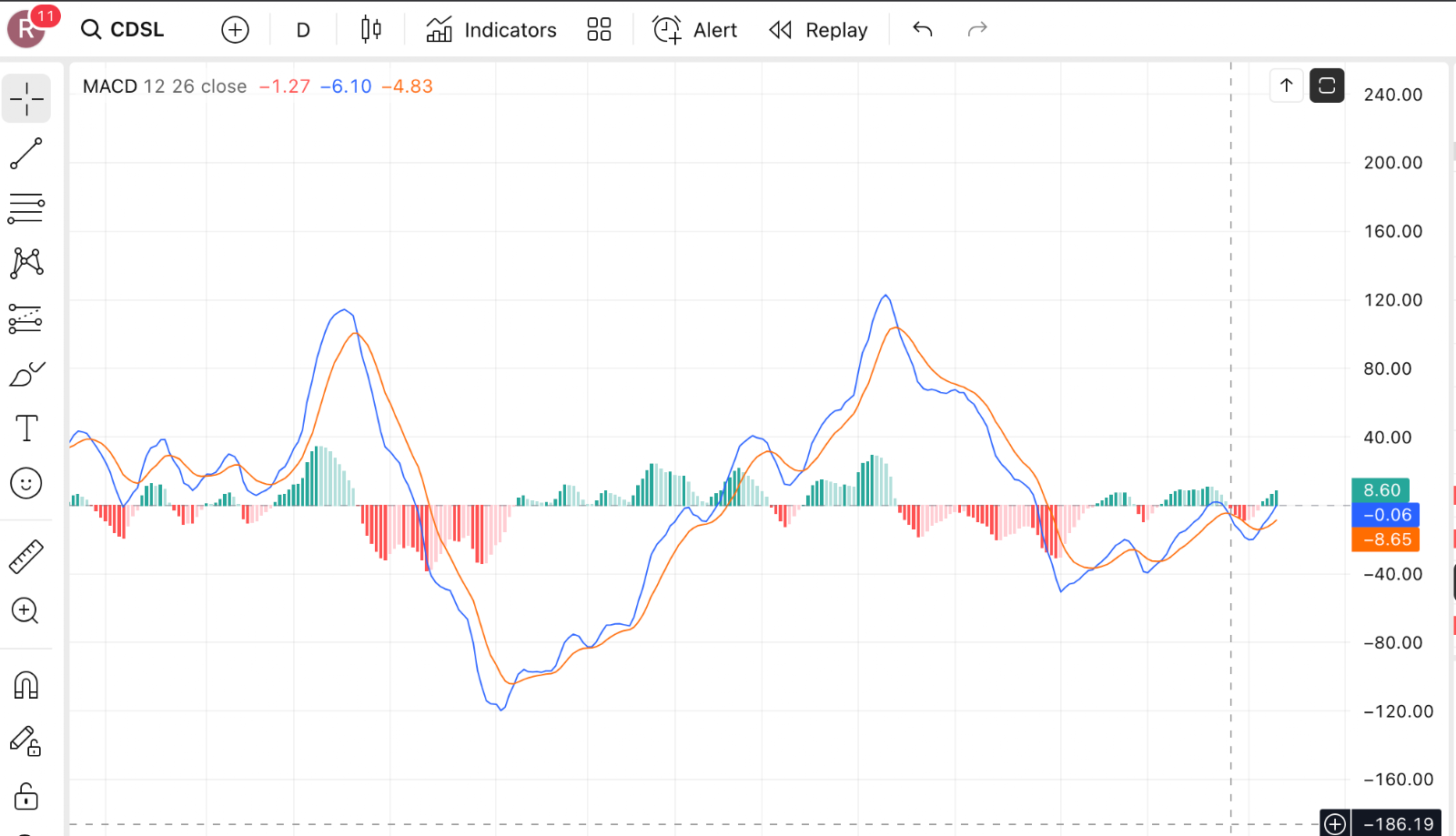
Here’s a simple example to illustrate how the MACD works:
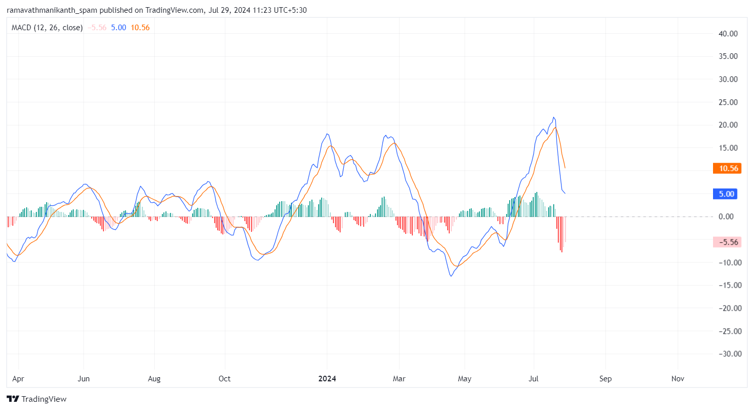
Another example,
On Indian exchanges, MACD is particularly popular among Nifty and Bank Nifty traders who use it on daily and hourly timeframes to confirm trend direction before entering positions. Its visual clarity, with distinct line crossovers and histogram bars, makes it one of the first indicators that new traders learn to read, though using it effectively in live market conditions requires understanding its nuances and limitations beyond the basic crossover signals.
Why Traders Prefer MACD?
MACD is popular among traders for several practical reasons:
Easy to Understand
MACD is built on moving averages, which makes it intuitive to interpret. Its clear signals and visual format help traders quickly grasp when momentum is shifting. Unlike oscillators that operate within a fixed range (like RSI’s 0–100 scale), MACD has no upper or lower boundary, which means it can continue expanding as long as momentum is accelerating, giving a more dynamic picture of trend strength.
Deep Market Insight
Beyond just buy and sell signals, MACD offers information about the strength and direction of a trend. The histogram component, in particular, shows whether momentum is accelerating or decelerating even before a crossover occurs, which can provide earlier signals than waiting for the lines to cross. This acceleration-deceleration reading is something many traders find more useful than the crossover itself once they become familiar with the indicator.
Versatility
MACD can be used across various asset classes, including equities, commodities, and forex, and across multiple timeframes. Whether you’re analysing a 15-minute Bank Nifty chart for intraday trades or a weekly Nifty 50 stock chart for positional analysis, the same indicator logic applies, though the signal frequency and reliability differ across timeframes.
MACD Formula and Components
MACD consists of three elements, each serving a distinct purpose. Understanding all three is essential to reading the indicator correctly.
MACD Line
The MACD line is derived from the difference between two exponential moving averages (EMAs):
MACD Line = 12-Period EMA − 26-Period EMA
This computes the short-term momentum relative to the long-term trend. When the 12-period EMA is above the 26-period EMA, the MACD line is positive, indicating that short-term momentum is bullish. When the 12-period EMA is below the 26-period EMA, the MACD line is negative, indicating bearish short-term momentum.
The choice of 12 and 26 periods as defaults is not arbitrary. These settings were originally designed for six-day trading weeks (12 trading days representing two calendar weeks, and 26 representing approximately one calendar month under the older six-day convention). While these defaults work well for daily charts of most Indian stocks and indices, some intraday traders adjust to shorter settings (like 8, 17, 9) for more responsive signals on 15-minute or hourly charts. The trade-off with shorter settings is always the same: faster signals but more noise and false crossovers.
Signal Line
The Signal Line is a 9-period EMA of the MACD line. It smooths out the fluctuations in the MACD line and serves as the trigger for buy and sell signals. When the MACD line crosses above the Signal line, it generates a bullish signal. When it crosses below, it generates a bearish signal.
The Signal line essentially acts as a moving average of momentum itself. Because it lags the MACD line slightly (being a smoothed version of it), crossovers between the two lines confirm that a momentum shift has occurred rather than predicting one. This is why MACD is classified as a lagging indicator, though the histogram component (described below) can provide somewhat earlier readings.
Histogram
The histogram represents the distance between the MACD line and the Signal line:
Histogram = MACD Line − Signal Line
It visually shows changes in momentum, making it easier to spot trend strength or weakening trends at a glance. The histogram is positive when the MACD line is above the Signal line and negative when it’s below.
Example 1:

Example 2:
The histogram’s most useful feature is that it shows momentum acceleration and deceleration. When the histogram bars are growing taller (whether positive or negative), momentum is accelerating. When the bars start shrinking, momentum is decelerating, even if the MACD and Signal lines haven’t crossed yet. This early deceleration signal is what experienced MACD traders watch most closely, because it often precedes a crossover by several sessions, providing time to prepare rather than react.
How MACD Works?
The MACD works by showing the relationship between short-term and long-term price momentum. When the two moving averages move closer together (convergence), it usually signals that the momentum is slowing down. When they move further apart (divergence), it indicates that momentum is building in the direction of the trend.
When short-term momentum strengthens relative to long-term momentum, the MACD line rises above the Signal line, suggesting a potential upward move. Conversely, when short-term momentum weakens, the MACD line falls below the Signal line, hinting at a possible downward trend.
The Zero Line
A key feature to watch is the zero line, which acts as the baseline for momentum. When the MACD is above zero, it indicates that the 12-period EMA is above the 26-period EMA, meaning bullish momentum is dominant. When it’s below zero, the 26-period EMA is above the 12-period EMA, signalling bearish momentum.
The zero line crossing is a stronger signal than the Signal line crossover alone. A MACD line that crosses above zero confirms that the short-term trend has definitively shifted above the long-term trend, not just that momentum is temporarily improving. On daily charts of Nifty 50 stocks, a MACD zero line crossover from negative to positive territory, when accompanied by rising volume, has historically been a reliable signal that a multi-week uptrend is establishing itself.
By keeping an eye on convergence, divergence, and the zero line, traders can get a clearer picture of where the market might be headed and, importantly, how much conviction is behind the current price movement.
Interpreting MACD Signals
These signals help traders decide when to enter or exit a trade. Here’s a breakdown of the main ones:
Signal Line Crossovers
When the MACD line crosses above the Signal line, it’s a bullish crossover signalling a potential uptrend. When it crosses below, it’s a bearish crossover indicating a possible downtrend.
This is the most commonly used MACD signal. However, in choppy or range-bound markets, the MACD and Signal lines can cross each other repeatedly in quick succession, generating a series of whipsaw signals that result in small losses on each trade. A practical filter is to only act on crossovers that occur on the same side of the zero line as the intended trade direction. For example, a bullish crossover that happens while the MACD is already above zero (confirming the broader trend is bullish) tends to be more reliable than one that occurs below zero, where the overall trend is still bearish and the crossover may represent only a temporary bounce.
Zero Line Crossovers
When the MACD moves above the zero line, it indicates strengthening bullish momentum. When it moves below, it shows bearish momentum is taking over.
Zero line crossovers are less frequent than Signal line crossovers and tend to lag further behind the actual price turn. However, they are generally more reliable as trend confirmation signals. A strategy that combines both: use the Signal line crossover as the entry trigger and the zero line position as the directional filter. Only take bullish Signal line crossovers when MACD is above zero or approaching it from below, and only take bearish crossovers when MACD is below zero or declining toward it.
Divergence
Divergence occurs when the price moves in one direction, but the MACD moves in the opposite direction, potentially signalling a trend reversal.
Bullish Divergence: The price makes lower lows while the MACD forms higher lows. This suggests that downward momentum is weakening even though prices are still falling, and a reversal upward may be approaching.
Bearish Divergence: The price makes higher highs while the MACD forms lower highs. This indicates that upward momentum is fading even though prices are still rising, warning of a potential reversal downward.
Example for Bearish Divergence:
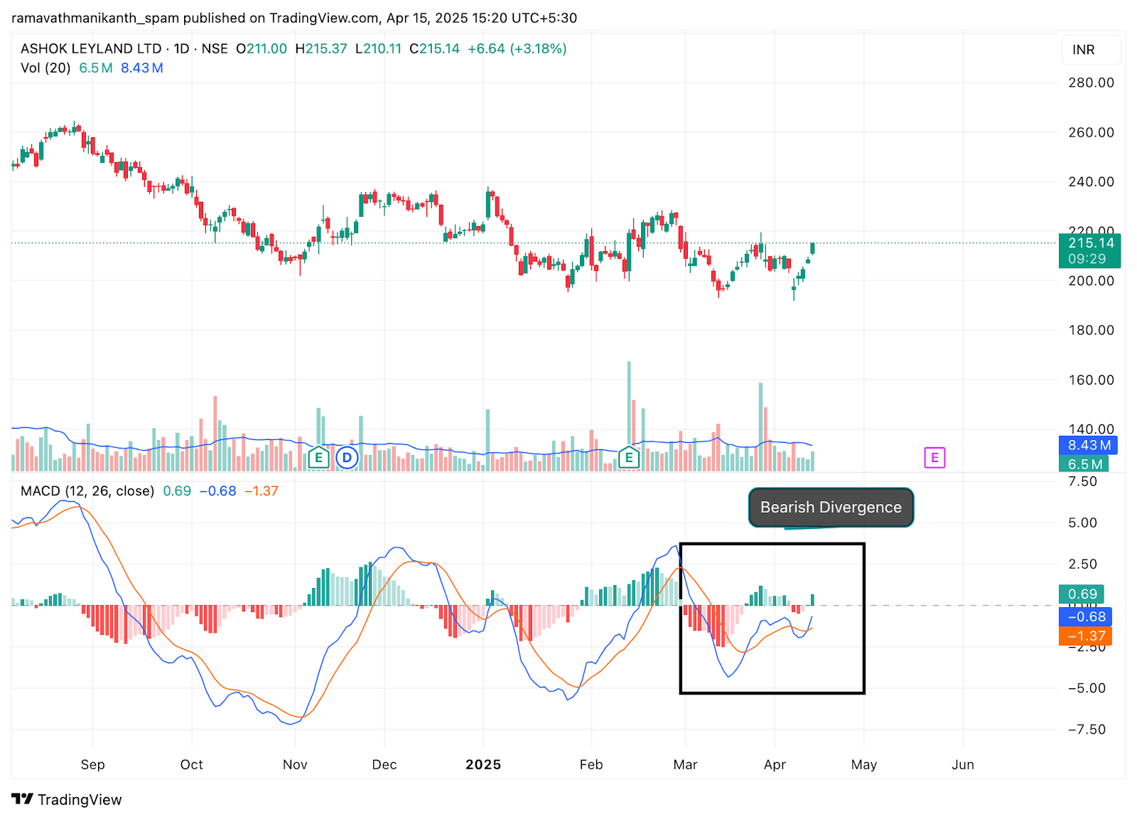
Divergence is considered one of the more powerful MACD signals because it identifies a disconnect between price and momentum before the price itself confirms the reversal. However, divergence can persist for extended periods before the reversal actually occurs. A stock can show bearish divergence on the daily chart for two to three weeks while continuing to rise, eventually reversing, but with timing that is difficult to pinpoint precisely. Using divergence as an alert to tighten stop-losses or reduce position sizes, rather than as an immediate entry signal, is often the more practical application.
Histogram Analysis
Beyond crossovers and divergence, the histogram provides its own set of signals:
Growing histogram bars (whether positive or negative) indicate accelerating momentum in the current direction. This suggests the trend is strengthening and continuation is likely.
Shrinking histogram bars indicate decelerating momentum. When the positive histogram starts producing shorter bars, it warns that bullish momentum is fading, even if the MACD is still above the Signal line. This deceleration signal often appears two to four sessions before the actual crossover, providing an early warning.
Histogram peak/trough reversals occur when the histogram changes from growing to shrinking. These can be used as early entry or exit signals by traders who want to act before the full crossover confirmation. On Nifty and Bank Nifty daily charts, histogram reversals from extreme positive values often coincide with short-term price peaks, making them useful for timing partial profit-taking.
MACD in Practice: Application in Trading
Intraday Trading
For intraday traders on Indian exchanges, MACD on a 15-minute or hourly chart provides signals for short-term momentum shifts within the trading day. The standard 12, 26, 9 settings on a 15-minute chart capture moves that develop over a few hours, which suits the 6.25-hour Indian trading session (9:15 AM to 3:30 PM). Some intraday traders use shorter settings like 8, 17, 9 for faster signals, though this increases the number of whipsaw crossovers during choppy sessions.
A practical intraday approach: use the MACD on a 15-minute chart to identify the session’s dominant trend direction (bullish if MACD is above zero, bearish if below), and then use shorter timeframe price action or a secondary indicator for entry timing within that directional bias.
Swing Trading
On daily charts, MACD is well-suited for swing trades that last one to three weeks. A bullish Signal line crossover on the daily chart of a Nifty 50 stock, particularly when it occurs near or above the zero line and is accompanied by above-average volume, can signal the beginning of a swing move that lasts 8–15 sessions. The stop-loss is typically placed below the most recent swing low, and the target is set at the next resistance level or based on a risk-reward ratio.
Positional Trading
On weekly charts, MACD signals are less frequent but more significant. A weekly MACD bullish crossover on Nifty or on a sector index like Bank Nifty can signal a trend that lasts several months. These signals occur only a few times per year, which makes them more reliable but also means that the entry point is typically later in the trend’s development than faster indicators would provide.
Combining MACD with Other Tools
MACD works best when confirmed by at least one additional independent signal:
MACD + RSI
RSI confirms overbought/oversold conditions while MACD confirms trend direction. If MACD gives a bullish crossover while RSI is bouncing from oversold territory (below 30), the combined signal is stronger than either alone. If MACD gives a bullish crossover but RSI is already in overbought territory (above 70), the upside may be limited.
MACD + Support/Resistance
A MACD bullish crossover that coincides with the price bouncing off a known support level provides confluence. The support level gives the price-based reason for a bounce, while MACD confirms that momentum is shifting in the same direction.
MACD + Volume
A MACD crossover accompanied by a volume spike suggests genuine participation behind the momentum shift. A crossover on declining volume is more suspect and may reverse quickly.
MACD vs RSI
Both MACD and RSI are among the most commonly used indicators, but they measure different things and serve different purposes:
| Feature | RSI | MACD |
|---|---|---|
| Type | Momentum-based oscillator | Trend-following indicator with momentum characteristics |
| Primary Focus | Measures pace of price movements to spot overbought/oversold conditions | Tracks the relationship between two moving averages to determine trend direction and momentum strength |
| Components | Single line within a fixed 0–100 range | MACD line, Signal line, and Histogram around a zero line |
| Scale | Fixed range between 0 and 100 | No fixed range; values move freely above or below zero |
| Key Signals | Overbought (>70), oversold (<30), and divergence | Line crossovers, zero-line crossovers, divergence, and histogram patterns |
| Leading vs Lagging | Often acts as a leading indicator, especially with divergence | Typically a lagging indicator that confirms trends after they begin |
| Best Use Case | Spotting reversals in range-bound or mildly trending markets | Confirming trends and evaluating momentum in trending markets |
| Default Settings | 14 periods | 12 EMA, 26 EMA, 9 Signal line |
Neither indicator is universally better than the other. RSI excels in range-bound conditions where identifying overbought and oversold extremes helps time mean-reversion trades. MACD excels in trending markets where confirming the trend’s direction and strength is more important than identifying extremes. Using both together, with RSI for timing and MACD for trend confirmation, covers a broader range of market conditions than either indicator alone.
On Indian markets, a common combined setup is: use weekly MACD to establish the trend direction for a stock, then use daily RSI to time entries during pullbacks within that trend. If the weekly MACD is bullish (above zero and the Signal line) and the daily RSI dips below 40 during a pullback, it can signal a buying opportunity within a confirmed uptrend.
Limitations and Challenges of MACD
While MACD is a practical and widely used tool, it has limitations that every trader should be aware of:
False Signals in Sideways Markets
During consolidation or range-bound phases, the MACD line and Signal line can oscillate around each other, producing frequent crossovers that don’t lead to sustained directional moves. Each of these false crossovers can result in a small loss if traded mechanically, and the cumulative effect across multiple false signals can be meaningful. A practical filter is to check whether the histogram bars are making progressively higher peaks or lower troughs. If the histogram is oscillating between small positive and small negative values without expanding, the market is likely range-bound and MACD crossovers should be treated with scepticism.
Lagging Nature
Because MACD is calculated from moving averages, which are themselves derived from past price data, the indicator inherently lags behind actual price movement. By the time a MACD crossover confirms a trend change, the price may have already moved a significant distance from the turning point. On fast-moving Indian stocks, particularly during event-driven moves like earnings surprises or sector-wide news, the MACD crossover can appear several sessions after the optimal entry point. Accepting this lag as a trade-off for signal reliability, rather than trying to front-run the indicator, generally produces better results.
Need for Confirmation
Acting on MACD signals alone, without confirmation from price action, volume, or another indicator, increases the risk of false entries. Always consider whether the MACD signal aligns with the broader market context. A bullish MACD crossover on an individual stock is less convincing if the broader Nifty is in a confirmed downtrend and the stock’s sector index is also declining.
Parameter Sensitivity
The default 12, 26, 9 settings work well for daily charts in most situations, but they may not be optimal for every stock or timeframe. A stock with inherently high volatility may produce better results with slightly longer settings (like 15, 30, 9) that filter out more noise, while an intraday chart may need shorter settings for timely signals. However, excessive optimisation of MACD parameters to fit past data often leads to curve-fitting that doesn’t hold up in live trading. Sticking with the default settings, which are the most widely used and therefore most likely to be reflected in market behaviour, is generally the safer approach.
Conclusion
The MACD is a practical and versatile tool that helps traders see the underlying momentum of a stock or market. Comparing short-term and long-term moving averages highlights whether trends are strengthening, weakening, or about to reverse. Its three components, the MACD line, Signal line, and histogram, work together to provide actionable insights, from identifying bullish or bearish momentum to spotting potential reversals through divergence.
The indicator performs best in trending markets, where its ability to confirm trend direction and measure momentum strength is most valuable. In range-bound conditions, its signals become less reliable and require stricter filtering or confirmation from other tools. Combining MACD with support/resistance levels, RSI, or volume analysis makes the signals more dependable and reduces the risk of acting on false crossovers.
Used with an understanding of its strengths and limitations, and with the discipline to confirm signals rather than acting on them blindly, MACD can meaningfully improve the timing and conviction behind trading decisions.
FAQs Related to MACD
What is MACD, and how does it work?
MACD, or Moving Average Convergence Divergence, is a technical indicator that shows the strength and direction of a trend. It compares a short-term (12-period) and a long-term (26-period) exponential moving average of a stock’s price. When the MACD line crosses the Signal line or moves above or below the zero line, it provides signals about potential trend changes or momentum shifts. The histogram component adds further detail by showing whether momentum is accelerating or decelerating.
Is MACD a leading indicator or a lagging indicator?
MACD is primarily a lagging indicator because it’s derived from moving averages, which are based on past price data. The crossover signals confirm a trend change after it has already begun, not before. However, the divergence signal and the histogram’s acceleration-deceleration readings can provide somewhat earlier indications of momentum shifts. Among lagging indicators, MACD is considered relatively responsive because the use of EMAs (which give more weight to recent prices) makes it faster than indicators based on simple moving averages.
What is a good MACD signal?
A strong MACD signal typically has multiple confirming factors. A bullish crossover (MACD line crossing above the Signal line) is stronger when it occurs above or near the zero line, is accompanied by rising volume, happens near a known support level, and when the histogram shows expanding positive bars. A single crossover in isolation, particularly one occurring in a range-bound market or against the broader trend, is a weaker signal and is more likely to produce a false entry.
Which is better, MACD or RSI?
Neither is universally better; they measure different things and excel in different conditions. RSI is more useful for identifying overbought and oversold extremes, making it well-suited for range-bound markets. MACD is better at confirming trend direction and momentum strength, making it more useful in trending markets. Most traders who use both find that combining them, using MACD for trend confirmation and RSI for timing, produces more reliable signals than relying on either indicator alone.
How should beginners start using MACD?
Start by applying the default settings (12, 26, 9) on daily charts of liquid stocks or indices like Nifty 50. Focus on learning to identify the three main signals: Signal line crossovers, zero line crossovers, and divergence. Before using MACD for live trades, spend time observing how the indicator behaves on historical charts, noting where the crossovers occurred relative to actual price turning points and how much lag was involved. This builds realistic expectations about what MACD can and cannot do, which is more valuable than memorising the rules mechanically.
Disclaimer: This content is for educational purposes only and does not constitute financial or investment advice. Investments in securities or other financial instruments are subject to market risk, including partial or total loss of capital. Past performance is not indicative of future results. Always consider your financial situation carefully and consult a licensed financial advisor before making investment or trading decisions.
Engineered for the obsessed. Built for traders.

Purpose-built terminals.
Zero compromise.
Built for speed.
Plot No 1290, 2nd Floor, 17th Cross, 5th Main, Sector-7, HSR Layout, Bangalore 560102
Follow us on
Mintcap Brokers Private Limited
CIN – U66110KA2023PTC178706 | Registered Address: Plot No 1290, Second Floor, 17th Cross, 5th Main, Sector-7, HSR Layout, Bangalore 560102 | Tel: 080 – 49552310 | Email ID: compliance@capmint.com | SEBI registered Stock Broker: INZ000322732 | NSE Cash/F&O Member ID: 90430 | BSE Cash/F&O Member ID: 6903 | MCX Member ID: 57400 | NCDEX Member ID: 1312 | SEBI registered Depository Participant: IN-DP-806-2025 | CDSL DP ID: 12102300 | NSE Clearing Member code: M70108 | AMFI-Registered Mutual Fund Distributor: ARN-289109 (Valid upto 28-Feb-2027) | Category II Execution Only Platform : E6903
Details of Client Bank Account
Compliance Officer: Ms. Shridevi Vungarala | Email ID: compliance@capmint.com | Tel no. + 91 9035330126 | Grievance Redressal Officer (GRO) – Ms. Shikha Gupta | Email ID: Grievance@capmint.com | Tel no: 9035331595.
Procedure to file a complaint on SEBI SCORES: Register on SCORES portal. Mandatory details for filing complaints on SCORES: Name, PAN, Address, Mobile Number, E-mail ID. Benefits: Effective Communication, Speedy redressal of the grievances. You may refer the website https://scores.sebi.gov.in/ for more information. You may also download the SEBI Scores app to log a complaint Android: https://play.google.com > store > apps > sebiscores iOS: https://apps.apple.com > app > sebiscores
Disclaimer
Investment in the securities market are subject to market risks, read all the related documents carefully before investing. Brokerage will not exceed the SEBI prescribed limit.
Mutual fund investments are subject to market risks, read all scheme related documents carefully before investing. Mutual Funds are not exchange-traded products.
Attention Investor:
- Stock Brokers can accept securities as margin from clients only by way of pledge in the depository system w.e.f. September 1, 2020.
- Update your mobile number & email Id with your stock broker/depository participant and receive OTP directly from depository on your email id and/or mobile number to create pledge.
- Pay 20% as upfront margin of the transaction value to trade in cash market segment.
- Investors may please refer to the Exchange’s Frequently Asked Questions (FAQs) issued vide circular reference NSE/INSP/45191 dated July 31, 2020 and NSE/INSP/45534 dated August 31, 2020 and other guidelines issued from time to time in this regard.
- Check your Securities /MF/ Bonds in the consolidated account statement issued by NSDL/CDSL every month.