
Link copied!
Dark Cloud Cover Pattern
The Dark Cloud Cover pattern is a bearish reversal candlestick pattern that typically appears at the top of an uptrend. It signals that the upward momentum might be slowing down and that a potential trend reversal to the downside could be coming.
Key Takeaways
- Dark Cloud Cover signals a possible trend reversal after an uptrend; it forms when a red candle closes below the midpoint of a prior green candle.
- The pattern shows buyers losing control and sellers stepping in; it captures the psychological transition from bullishness to bearishness.
- Use indicators like RSI, MACD, or a third bearish candle to confirm the signal, and always consider the broader market context before acting on it.
- The pattern doesn’t guarantee a downtrend or predict the fall’s depth; it’s most effective when combined with risk management and other tools.
Introduction to Dark Cloud Cover Pattern?
Let’s say a stock has been rising steadily for a few days. Everything looks strong, and it seems like the upward trend might continue. Suddenly, a large red candle appears on the chart, signalling that the momentum might be shifting. This red candle could be part of a pattern called the Dark Cloud Cover, a sign that buyers (bulls) are losing control and sellers (bears) are starting to take over.
In this guide, we’ll break down the Dark Cloud Cover candlestick in the simplest way possible. Whether you’re new to trading or just brushing up on candlestick patterns, this will help you understand how it works, why it matters, and how you can use it.
What is the Dark Cloud Cover Pattern?
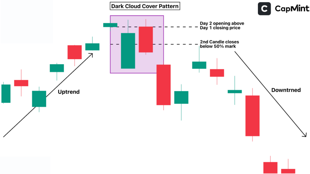
The Dark Cloud Cover is a bearish candlestick pattern that signals a potential trend reversal from up to down. It’s made up of two candles:
- First candle: A long green (bullish) candle that shows strong buying.
- Second candle: A red (bearish) candle that opens higher than the first candle’s close but ends up closing below the midpoint (50%) of that green candle.
This shift from strong buying to strong selling often hints that the uptrend may be coming to an end. The deeper the red candle closes into the green candle’s body, the stronger the signal tends to be. A close that barely crosses the midpoint carries less weight than one that penetrates 60–70% of the prior candle.
How is the Dark Cloud Cover Pattern Formed?
Let’s break it down step-by-step:
The Uptrend
First, the stock or asset must already be in an uptrend. This means the price has been moving upward for a few days or even weeks, where the buyers are confident, and the market sentiment is positive.
Strong Green Candle Appears
During this uptrend, a long green candlestick forms. This shows that the buyers are still in control and pushing the price even higher.
Gap-Up Opening the Next Day
On the following trading day, the market opens higher than the previous day’s closing price. This gap-up gives the impression that the buying momentum will continue. It’s a strong signal that bulls are still optimistic. Worth noting that in Indian markets, gap-ups on Nifty 50 stocks tend to be smaller than what textbook examples suggest, often just 0.3–0.8%, so the pattern can be subtler to spot on daily charts.
Sudden Shift During the Day
But instead of continuing upward, the price starts falling throughout the day. The red candle not only closes below its opening price but also drops deep into the previous green candle, usually below its halfway mark.
This creates the “dark cloud” effect, a bearish candle hanging over the bullish trend like a warning signal. It’s a sign that sellers have stepped in aggressively and may take control from here.
In simple terms, it’s like the market gets excited in the morning but changes its mind by the end of the day, signalling potential trouble ahead.
Psychology Behind the Pattern
When the first green candle forms, it reflects a strong sense of confidence in the market. Buyers are feeling positive, and prices are climbing steadily. Everything looks like it’s going well. Then, the next day begins with even more excitement as the price opens higher than the previous close, giving the impression that the rally will continue. It feels like the bulls are still charging ahead.
But things take a sharp turn. Instead of continuing higher, sellers step in and drive the price down. The red candle that forms closes well below the midpoint of the previous green candle, signalling a loss of buyer strength.
This shift in control from buyers to sellers is the key message of the pattern. It shows hesitation, a pause in optimism, and the possibility that the uptrend might be ending. For traders, this is a heads-up to stay cautious and look for confirmation before taking a position. One behavioural tendency worth watching for: retail participants who bought during the gap-up opening often begin panic-selling in the final hour, which can accelerate the close below the midpoint.
How to Trade the Dark Cloud Cover Pattern?
Here’s how you can use this pattern in real trading:
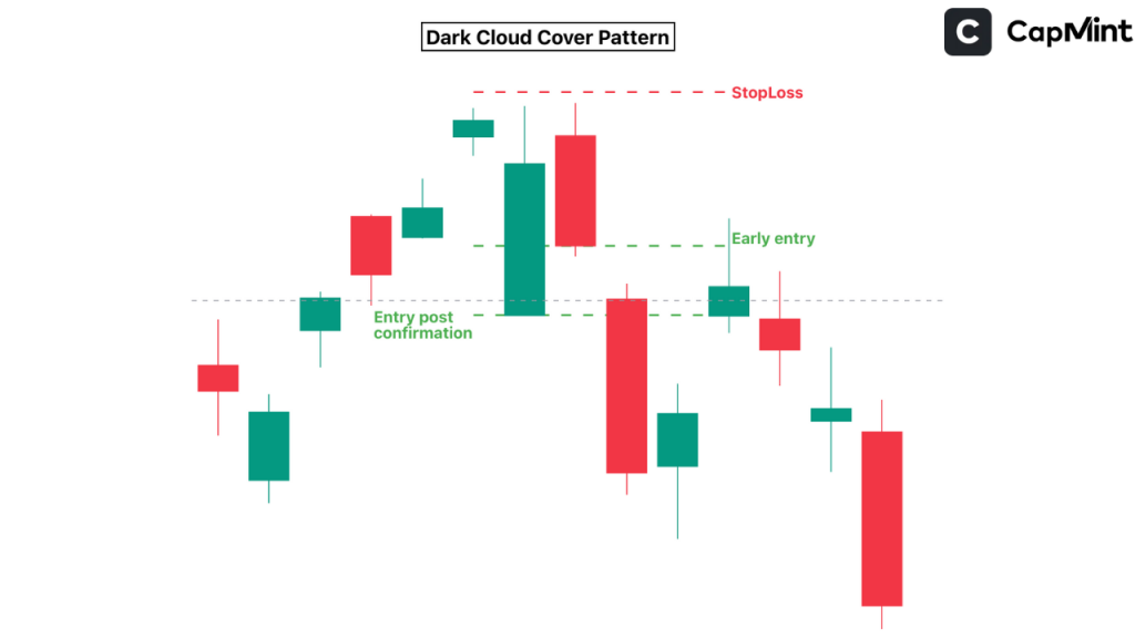
1. Entry Point
For risk-takers, enter a short trade (betting the price will go down) once the second candle closes below the midpoint of the first.
For safer trading, wait for a third red candle to confirm the reversal. This extra day of patience filters out a significant number of false signals, particularly in volatile mid-cap stocks where intraday reversals are common.
2. Stop-Loss
Place the stop just above the high of the second candle. If the price goes above that, the pattern might have failed.
3. Profit Target
Aim for the nearest support level, or use tools like Fibonacci retracement for targets. A practical approach is to measure the height of the first green candle and project that distance downward from the second candle’s close as a minimum target.
Bonus Tip: Use indicators like RSI or MACD for extra confirmation, since depending on the Dark Cloud Cover alone can be a risky bet.
Difference Between Dark Cloud Cover vs Bearish Engulfing
While both the Dark Cloud Cover and Bearish Engulfing patterns signal a possible trend reversal, they do it in slightly different ways.
In the Bearish Engulfing pattern, the red candle completely swallows the previous green candle, both the body and sometimes even the shadow of the previous candle. It’s a bold sign that sellers have taken over, and it’s often considered a stronger signal of a reversal.
On the other hand, in the Dark Cloud Cover pattern, the red candle opens above the prior green candle’s close, but only closes below its midpoint; it doesn’t fully engulf it. This shows a shift in momentum, but it’s more of a warning sign than a confirmation.
So, while both patterns are bearish, the Bearish Engulfing is generally more forceful, whereas the Dark Cloud Cover gives an early signal that the trend might be changing, especially when combined with other indicators. In practice, the distinction matters most on daily timeframes. On intraday charts (15-minute or lower), both patterns tend to produce similar hit rates because gap-ups are less pronounced.
Limitations of the Dark Cloud Cover Pattern
While the Dark Cloud Cover candlestick pattern is a helpful tool for spotting a possible trend reversal, it’s not foolproof. Let’s go over some of its key limitations in a clear and simple way:
Not Always Right
Just because this pattern appears doesn’t mean the price will definitely go down. Sometimes the stock might keep rising despite the bearish signal. This is especially common when the broader market or sectoral trend is strongly bullish, as individual stock patterns often get overridden by wider momentum. So, it’s not wise to rely on it alone.
Needs Extra Confirmation
Two candles can’t tell the whole story. Using indicators like RSI, MACD, or volume trends can give you stronger clues. Also, some traders prefer to wait for a third bearish candle to confirm that the trend is truly changing.
Doesn’t Work Well in Sideways Markets
If the stock isn’t clearly trending up or down and is just moving sideways, this pattern can pop up often and fail just as often. It’s more trustworthy when the stock has been moving up strongly before the pattern appears.
Doesn’t Show How Big the Drop Will Be
Even if the pattern is correct, it doesn’t tell us how far the price might fall. It gives a warning, not a prediction. So, always think about your stop-loss and target levels before entering a trade.
Context Matters
If the red candle doesn’t close well below the midpoint of the green candle, or if the price quickly bounces back the next day, the pattern might not be strong enough. Always look at the bigger picture, including support/resistance levels, trend lines, and volume. A Dark Cloud Cover forming near a known resistance zone, for instance, carries considerably more weight than one appearing in the middle of a range.
In short, the Dark Cloud Cover can be a valuable part of your trading toolkit, but it should be used alongside other tools and analysis. Being aware of its weaknesses can help you avoid false alarms and make smarter, more confident decisions.
Conclusion
The Dark Cloud Cover is a useful candlestick pattern that gives traders an early warning that an uptrend might be losing steam. While it doesn’t guarantee a trend reversal, it often signals a shift in market sentiment from bullish to bearish.
Like any pattern, it’s most effective when used in combination with other technical tools like volume analysis, RSI, MACD, and support/resistance levels. Understanding the psychology behind the candles and the context in which they appear will help you make more informed and confident trading decisions. Treat this pattern not as a standalone signal but as a part of a bigger trading strategy.
Frequently Asked Questions (FAQs)
Is the Dark Cloud Cover pattern reliable for trading?
It can be reliable, especially in strong uptrends, but it’s not foolproof. For best results, combine it with volume analysis, indicators like RSI or MACD, and wait for confirmation.
How is Dark Cloud Cover different from Bearish Engulfing?
In a Dark Cloud Cover, the red candle closes below the midpoint of the previous green candle. In a Bearish Engulfing, the red candle fully engulfs the green one, making it a stronger bearish signal.
Can I use the Dark Cloud Cover on any timeframe?
Yes, it can appear on any timeframe, i.e. daily, weekly, or even intraday charts. However, patterns on higher timeframes (like daily or weekly) generally carry more weight and tend to produce fewer false signals.
What should I look for to confirm the Dark Cloud Cover pattern?
Look for a third bearish candle, increased volume during the red candle, or bearish signals from technical indicators. These confirmations help reduce false signals.
Where should I place my stop-loss when trading this pattern?
A common approach is to place the stop-loss just above the high of the red candle. This protects you in case the reversal fails and the uptrend resumes.
Disclaimer: This content is for educational purposes only and does not constitute financial or investment advice. Investments in securities or other financial instruments are subject to market risk, including partial or total loss of capital. Past performance is not indicative of future results. Always consider your financial situation carefully and consult a licensed financial advisor before making investment or trading decisions.
Engineered for the obsessed. Built for traders.

Purpose-built terminals.
Zero compromise.
Built for speed.
Plot No 1290, 2nd Floor, 17th Cross, 5th Main, Sector-7, HSR Layout, Bangalore 560102
Follow us on
Mintcap Brokers Private Limited
CIN – U66110KA2023PTC178706 | Registered Address: Plot No 1290, Second Floor, 17th Cross, 5th Main, Sector-7, HSR Layout, Bangalore 560102 | Tel: 080 – 49552310 | Email ID: compliance@capmint.com | SEBI registered Stock Broker: INZ000322732 | NSE Cash/F&O Member ID: 90430 | BSE Cash/F&O Member ID: 6903 | MCX Member ID: 57400 | NCDEX Member ID: 1312 | SEBI registered Depository Participant: IN-DP-806-2025 | CDSL DP ID: 12102300 | NSE Clearing Member code: M70108 | AMFI-Registered Mutual Fund Distributor: ARN-289109 (Valid upto 28-Feb-2027) | Category II Execution Only Platform : E6903
Details of Client Bank Account
Compliance Officer: Ms. Shridevi Vungarala | Email ID: compliance@capmint.com | Tel no. + 91 9035330126 | Grievance Redressal Officer (GRO) – Ms. Shikha Gupta | Email ID: Grievance@capmint.com | Tel no: 9035331595.
Procedure to file a complaint on SEBI SCORES: Register on SCORES portal. Mandatory details for filing complaints on SCORES: Name, PAN, Address, Mobile Number, E-mail ID. Benefits: Effective Communication, Speedy redressal of the grievances. You may refer the website https://scores.sebi.gov.in/ for more information. You may also download the SEBI Scores app to log a complaint Android: https://play.google.com > store > apps > sebiscores iOS: https://apps.apple.com > app > sebiscores
Disclaimer
Investment in the securities market are subject to market risks, read all the related documents carefully before investing. Brokerage will not exceed the SEBI prescribed limit.
Mutual fund investments are subject to market risks, read all scheme related documents carefully before investing. Mutual Funds are not exchange-traded products.
Attention Investor:
- Stock Brokers can accept securities as margin from clients only by way of pledge in the depository system w.e.f. September 1, 2020.
- Update your mobile number & email Id with your stock broker/depository participant and receive OTP directly from depository on your email id and/or mobile number to create pledge.
- Pay 20% as upfront margin of the transaction value to trade in cash market segment.
- Investors may please refer to the Exchange’s Frequently Asked Questions (FAQs) issued vide circular reference NSE/INSP/45191 dated July 31, 2020 and NSE/INSP/45534 dated August 31, 2020 and other guidelines issued from time to time in this regard.
- Check your Securities /MF/ Bonds in the consolidated account statement issued by NSDL/CDSL every month.