
Link copied!
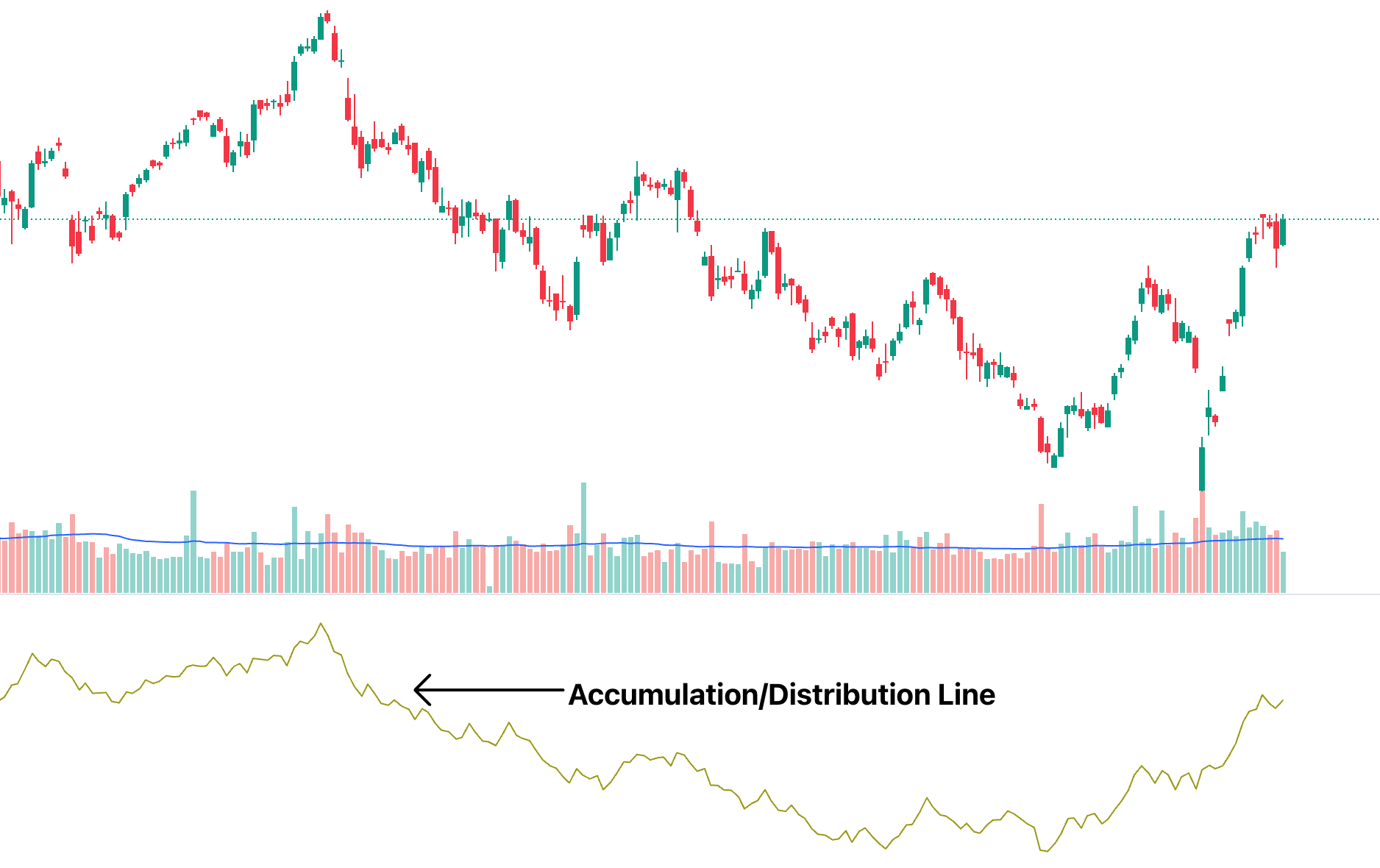
Accumulation/Distribution Line
The Accumulation/Distribution Line (A/D Line) is a technical analysis indicator that measures the cumulative flow of money into and out of a security. It tries to show whether a security is being bought or sold by tracking both price and volume over time.
Key Takeaways
- Purpose: The A/D line indicator tracks both price movements and trading volume to uncover the underlying buying or selling pressure, helping traders confirm the strength or weakness behind visible price trends.
- Calculation: It is calculated using the Money Flow Multiplier and daily volume, creating a cumulative line that reflects whether money is flowing into or out of a stock over time.
- Usage: By observing divergences between price and the indicator, traders can detect hidden accumulation or distribution, signalling possible upcoming reversals before they become visible on traditional price charts.
- Limitations: The indicator may miss intraday market dynamics and can generate false signals in highly volatile markets, making it more effective when combined with other technical tools like RSI or MACD.
What is the Accumulation/Distribution Line?
The Accumulation/Distribution Line is a technical analysis tool that shows how supply and demand might be affecting a stock’s price. In simple words, it looks at both the price and how many shares are being traded (volume) to tell whether people are buying or selling a stock.
Unlike just looking at price charts, the A/D Line helps traders see if a price move is truly strong or if it’s just a fakeout or another fake mover. Traders love using it because it can spot trends that aren’t visible just by staring at prices alone.
How the Accumulation/Distribution Line is Calculated?
Let’s try to understand step by step how the A/D Line works and how it is calculated.
Money Flow Multiplier:
Formula: Money Flow Multiplier = [(Close – Low) – (High – Close)] / (High – Low)
First, it looks at where the stock closed within its daily range (between the highest and lowest prices).
- If the stock closes near the high of the day, the multiplier will be closer to +1 (bullish).
- If it closes near the low, it will be closer to -1 (bearish).
Money Flow Volume:
Formula: Money Flow Volume = Money Flow Multiplier × Volume
Then, it multiplies this multiplier by the day’s volume to determine the amount of buying or selling pressure.
Cumulative Total:
Formula: Current A/D Line = Previous A/D Line + Current Period’s Money Flow Volume
Finally, it keeps a running total over time, creating the Accumulation/Distribution Line you see on charts.
To put it simply, high volume + strong closing prices = rising A/D Line, which indicates buying, while high volume + weak closing prices = falling A/D Line, which indicates selling or distribution.
Example of ADL Calculation
Now that you understand how the Accumulation/Distribution Line (A/D Line) is calculated, let’s walk through a simple example.
Given Data (One Trading Day):
- Opening price: ₹50
- Closing price: ₹55
- High: ₹58
- Low: ₹48
- Trading volume: 12,000 shares
- Previous ADL: 15,000
Step 1: Calculate Money Flow Multiplier (MFM)
MFM = [(Close − Low) − (High − Close)] ÷ (High − Low)
= [(55 − 48) − (58 − 55)] ÷ (58 − 48)
= (7 − 3) ÷ 10
= 4 ÷ 10
= 0.40
Step 2: Calculate Money Flow Volume (MFV)
MFV = MFM × Volume
= 0.40 × 12,000
= 4,800
Step 3: Calculate New ADL
New ADL = Previous ADL + Current MFV
= 15,000 + 4,800
= 19,800
Final Interpretation
Since the A/D Line increased from 15,000 to 19,800, it indicates accumulation, meaning buying pressure is stronger in the market.
If the value had decreased, it would indicate distribution, signalling selling pressure.
Interpretation of the A/D Line
The real power of the A/D Line comes from the deeper insights it offers when compared to the traditional price chart. It doesn’t just show where the price is moving; it reveals the underlying strength or weakness behind those moves.
Bullish Signals
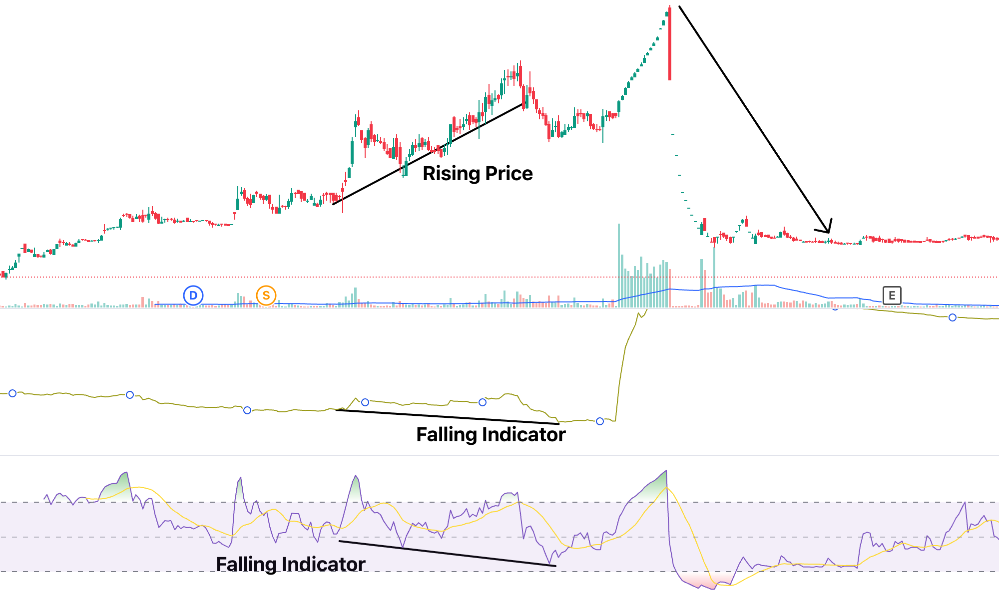
When the price of a stock is falling, but the A/D Line is rising, it’s a sign that smart money (experienced traders and institutions) might be quietly buying shares. Despite the visible drop in price, this hidden accumulation can suggest a potential upward reversal. Traders view this as a “positive divergence,” hinting that a bullish breakout could be around the corner.
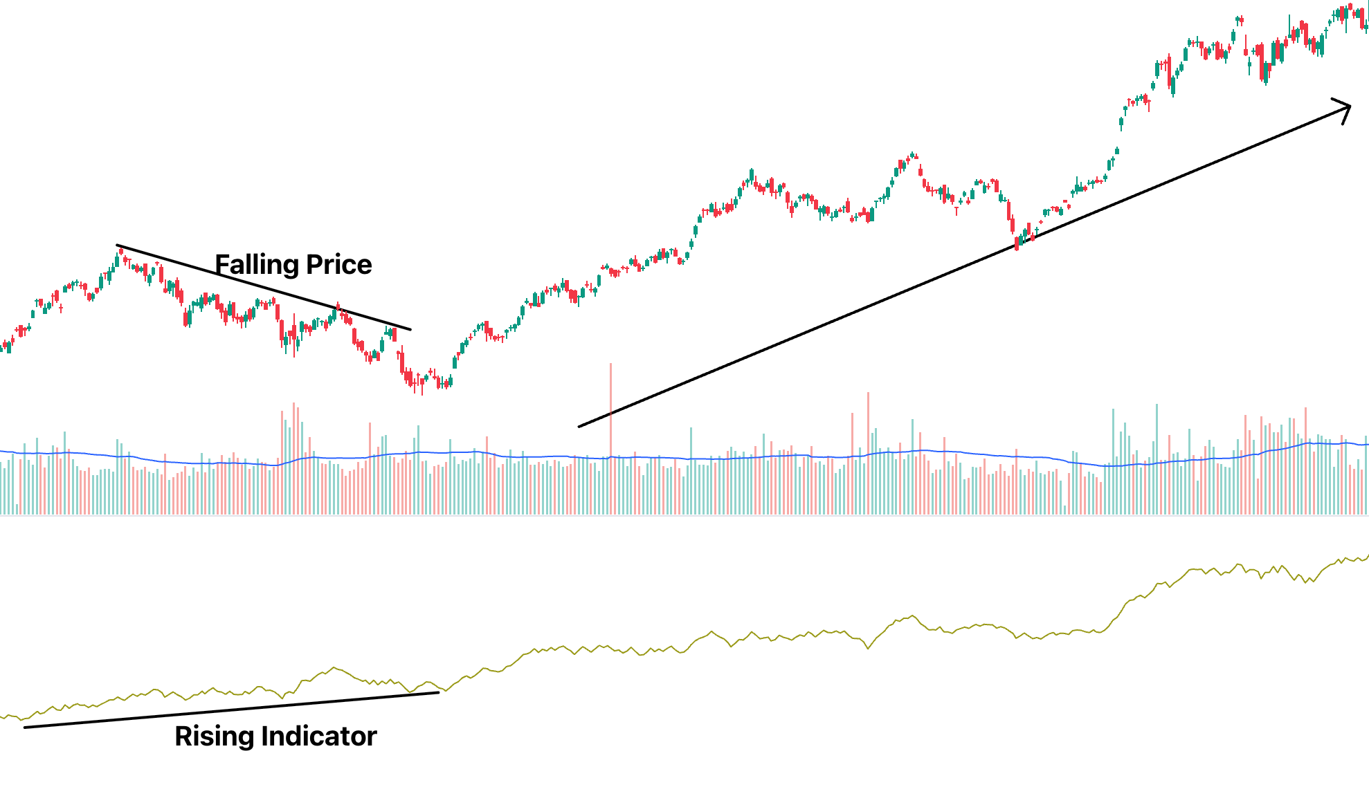
(Source: Nifty Nov 2022-Apr 2023)
Bearish Signals
On the flip side, if prices are climbing while the A/D Line is falling, it signals that selling pressure is quietly building up. This hidden distribution indicates that the current uptrend may not be sustainable. Traders call this a “negative divergence,” and it often warns of an upcoming downturn.
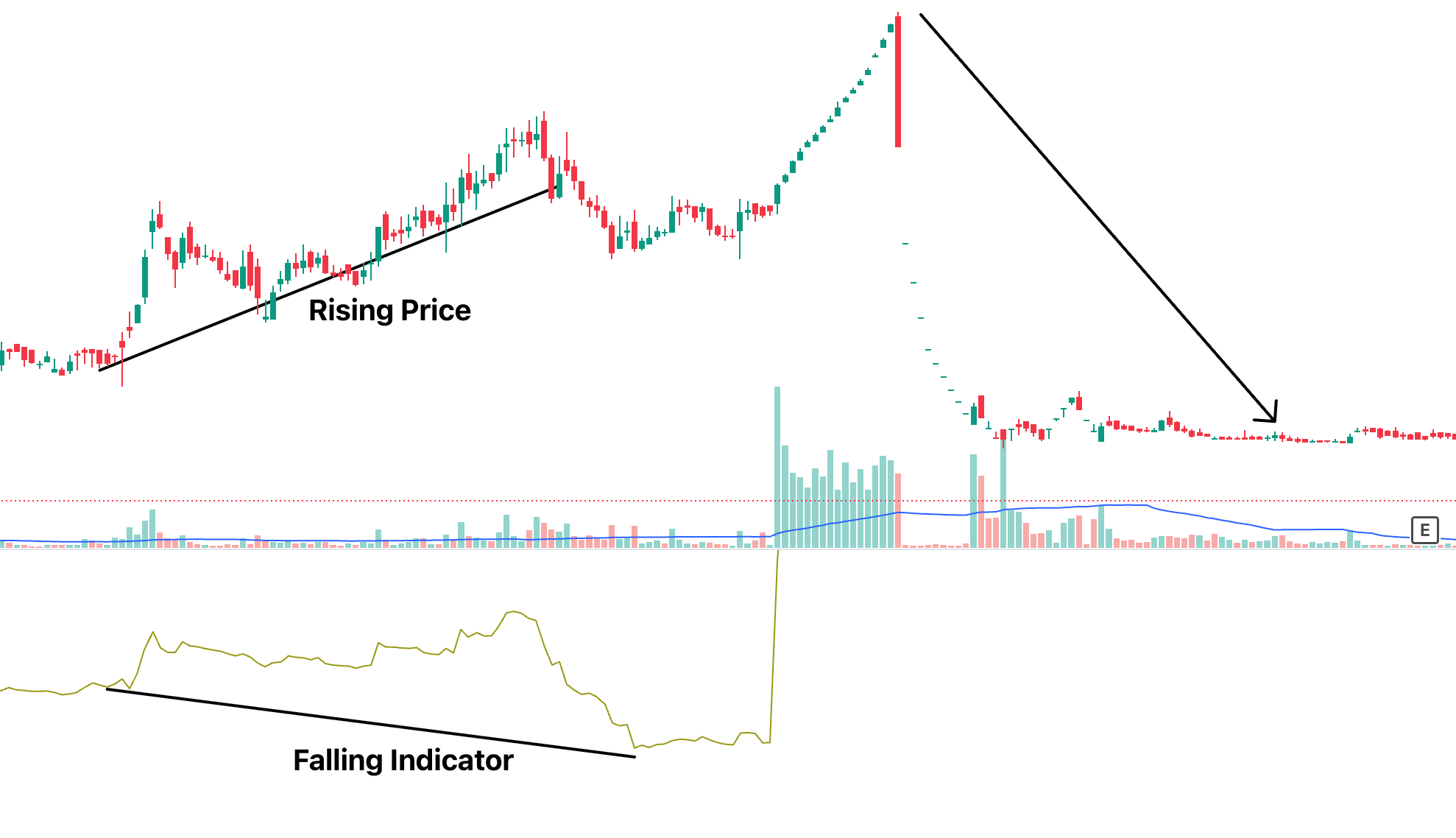
(Source: Axita Cotton Nov 2022-Jan 2024)
In essence, the A/D Line acts like a “truth detector” behind the scenes of price movements. It helps traders see whether a price trend is genuine or just a mirage, allowing them to make more informed and strategic decisions.
Once you have understood the interpretation, we can move forward to the part where we learn about how combining it with RSI can improve your trading strategy.
Combining the A/D Line with RSI
Once you have understood the interpretation of the A/D Line, the next step is to combine it with another powerful indicator: the Relative Strength Index (RSI).
The RSI measures the speed and magnitude of recent price changes to identify overbought or oversold conditions. While the A/D Line shows the underlying buying or selling pressure through volume, the RSI focuses purely on price momentum.
When used together, they form a dynamic duo that can significantly improve your trading decisions:
- If you see a bullish divergence (A/D Line rising while price is falling) and the RSI also shows the stock is oversold or close to an oversold region, it strengthens the case for a potential upside move.
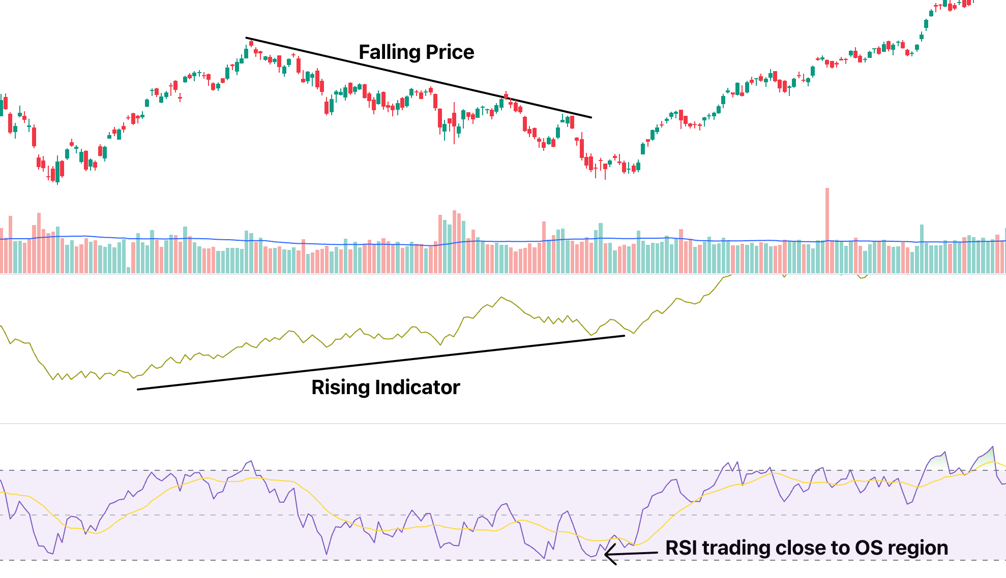
(Source: Nifty Nov 2022-Apr 2023)
- Also, if you see a bearish divergence in both indicators simultaneously, it could be a strong indicator that the stock might fall in the future.
(Source: Axita Cotton Nov 2022-Jan 2024)
Limitations and Common Mistakes
While the A/D Line is a powerful tool, it’s important to recognise that it has its flaws. Understanding these limitations can help you avoid common pitfalls and use the indicator more effectively
Limited Intraday Insights
Since the A/D Line relies on daily closing prices, it doesn’t fully capture what happens during the trading day. Intraday volatility, sudden spikes and drops that happen within market hours might not be reflected accurately, leading to a less complete picture.
Vulnerability to False Signals in Volatile Markets
In highly volatile or news-driven markets, price and volume can behave unpredictably. The A/D Line might show accumulation when, in reality, it’s just short-term chaos. Relying solely on the A/D Line in these conditions could result in poor trade decisions.
Because of these limitations, seasoned traders rarely depend only on the A/D Line. Instead, they combine it with other tools like RSI, Moving Averages, or MACD to create a more well-rounded and reliable trading strategy.
Conclusion
The Accumulation/Distribution Line offers valuable insights into the real strength behind price movements by combining price and volume analysis. While it can highlight hidden buying or selling pressures, it is not foolproof on its own. To maximise its effectiveness, traders should use it alongside complementary indicators like RSI or MACD. Understanding both its strengths and its limitations allows for smarter, more informed trading decisions in any market condition.
Frequently Asked Questions (FAQs)
What is the Accumulation/Distribution Line used for?
It helps traders spot whether a stock is being bought (accumulated) or sold (distributed) behind the scenes. By analysing volume in relation to price movements, the A/D Line offers a deeper look into market sentiment, helping traders make better-informed decisions about potential future trends.
How is the A/D Line different from On-Balance Volume (OBV)?
The A/D Line looks at the closing price inside the daily range, while OBV only considers if the price closed higher or lower. This means the A/D Line provides a more nuanced view, capturing not just direction but also the strength of price movements throughout the trading session, which makes it more insightful in certain conditions.
Can the Accumulation/Distribution Line predict market reversals?
It can give early warnings, especially when it moves opposite to the price. But it should be used with other indicators for confirmation. Watching for divergences between price and the A/D Line can alert traders to weakening trends, allowing them to prepare for potential reversals more effectively.
Disclaimer: This content is for educational purposes only and does not constitute financial or investment advice. Investments in securities or other financial instruments are subject to market risk, including partial or total loss of capital. Past performance is not indicative of future results. Always consider your financial situation carefully and consult a licensed financial advisor before making investment or trading decisions.
Engineered for the obsessed. Built for traders.

Purpose-built terminals.
Zero compromise.
Built for speed.
Plot No 1290, 2nd Floor, 17th Cross, 5th Main, Sector-7, HSR Layout, Bangalore 560102
Follow us on
Mintcap Brokers Private Limited
CIN – U66110KA2023PTC178706 | Registered Address: Plot No 1290, Second Floor, 17th Cross, 5th Main, Sector-7, HSR Layout, Bangalore 560102 | Tel: 080 – 49552310 | Email ID: compliance@capmint.com | SEBI registered Stock Broker: INZ000322732 | NSE Cash/F&O Member ID: 90430 | BSE Cash/F&O Member ID: 6903 | MCX Member ID: 57400 | NCDEX Member ID: 1312 | SEBI registered Depository Participant: IN-DP-806-2025 | CDSL DP ID: 12102300 | NSE Clearing Member code: M70108 | AMFI-Registered Mutual Fund Distributor: ARN-289109 (Valid upto 28-Feb-2027) | Category II Execution Only Platform : E6903
Details of Client Bank Account
Compliance Officer: Ms. Shridevi Vungarala | Email ID: compliance@capmint.com | Tel no. + 91 9035330126 | Grievance Redressal Officer (GRO) – Ms. Shikha Gupta | Email ID: Grievance@capmint.com | Tel no: 9035331595.
Procedure to file a complaint on SEBI SCORES: Register on SCORES portal. Mandatory details for filing complaints on SCORES: Name, PAN, Address, Mobile Number, E-mail ID. Benefits: Effective Communication, Speedy redressal of the grievances. You may refer the website https://scores.sebi.gov.in/ for more information. You may also download the SEBI Scores app to log a complaint Android: https://play.google.com > store > apps > sebiscores iOS: https://apps.apple.com > app > sebiscores
Disclaimer
Investment in the securities market are subject to market risks, read all the related documents carefully before investing. Brokerage will not exceed the SEBI prescribed limit.
Mutual fund investments are subject to market risks, read all scheme related documents carefully before investing. Mutual Funds are not exchange-traded products.
Attention Investor:
- Stock Brokers can accept securities as margin from clients only by way of pledge in the depository system w.e.f. September 1, 2020.
- Update your mobile number & email Id with your stock broker/depository participant and receive OTP directly from depository on your email id and/or mobile number to create pledge.
- Pay 20% as upfront margin of the transaction value to trade in cash market segment.
- Investors may please refer to the Exchange’s Frequently Asked Questions (FAQs) issued vide circular reference NSE/INSP/45191 dated July 31, 2020 and NSE/INSP/45534 dated August 31, 2020 and other guidelines issued from time to time in this regard.
- Check your Securities /MF/ Bonds in the consolidated account statement issued by NSDL/CDSL every month.