
Table of Content
- Key Takeaways
- What Are Chart Patterns?
- Why Chart Patterns Matter in Trading
- Different Types of Chart Patterns
- Most Popular Chart Patterns Explained
- How to Use Chart Patterns in Trading
- Common Mistakes to Avoid in Stock Chart Patterns
- Chart Patterns vs Indicators: What's Better?
- Conclusion
- Frequently Asked Questions (FAQs)
Link copied!
Chart Patterns
Chart patterns are visual formations created by the price movements of a stock (or any other asset) on a chart. Traders and technical analysts use these patterns to predict future price movements based on historical behaviour.
Key Takeaways
- Chart patterns reflect trader psychology and are used to anticipate future price movements based on past behaviour.
- There are three main types of patterns: Reversal (trend change), Continuation (trend resumes), and Bilateral (uncertain breakout direction).
- Effective trading requires confirmation: Look for volume support, breakout levels, and combine with indicators like RSI or MACD.
- Avoid common mistakes: Don’t force patterns, ignore volume, or trade without a proper stop-loss in place.
What Are Chart Patterns?
Candlestick chart patterns are formations created by the movement of price over time on a price chart. These patterns emerge as a result of market psychology, showing how traders collectively respond to events, news, or technical levels like support and resistance.
Also, read about candlesticks that form these chart patterns.
They form the foundation of technical analysis and are used to forecast future price movements based on historical behaviour. It is worth noting that no pattern guarantees an outcome. What patterns do is identify recurring setups where the probability of a particular move is higher than random, and that probability edge, when combined with disciplined risk management, is what makes them useful over a series of trades rather than any single one.
Why Chart Patterns Matter in Trading?
Chart patterns reveal market emotions and assist traders in foreseeing possible trend reversals or continuations. Identifying these patterns allows traders to make better-informed decisions and strengthen their timing and risk management. On Indian exchanges, where retail participation has grown significantly in recent years, many of the most commonly traded Nifty 50 and Bank Nifty stocks form recognisable chart patterns on daily candlestick timeframes with enough regularity to be practically useful, though the patterns tend to be less textbook-clean than what appears in educational material.
Different Types of Chart Patterns
Reversal Patterns
Reversal chart patterns signal that a current trend is likely to change direction, either from uptrend to downtrend or downtrend to uptrend. These technical chart patterns are key tools for technical traders to anticipate a shift in momentum. Common examples include:
- Head and Shoulders
- Double Top and Double Bottom
- Rounding Bottom
- Wedges (Rising and Falling)
Continuation Patterns
Continuation chart patterns suggest that the current trend (up or down) is likely to continue after a temporary pause or consolidation. These patterns are useful tools for identifying potential entry points within a trend, rather than trying to catch reversals. Examples include:
- Flags and Pennants
- Triangles (Ascending, Descending)
- Cup and Handle
- Rectangle
Bilateral Patterns
Bilateral stock market chart patterns are neutral formations that indicate a period of indecision in the stock market, where the price could break out in either direction, upward or downward. These patterns don’t lean toward bulls or bears until a clear breakout happens, so traders wait for confirmation before acting. Examples include:
- Symmetrical Triangle
- Wedge Patterns
Most Popular Chart Patterns Explained
Head and Shoulders
A reversal chart pattern that signals the end of an uptrend. It consists of a peak (shoulder), followed by a higher peak (head), and another lower peak (shoulder). A neckline connects the lows, and a break below confirms the pattern.
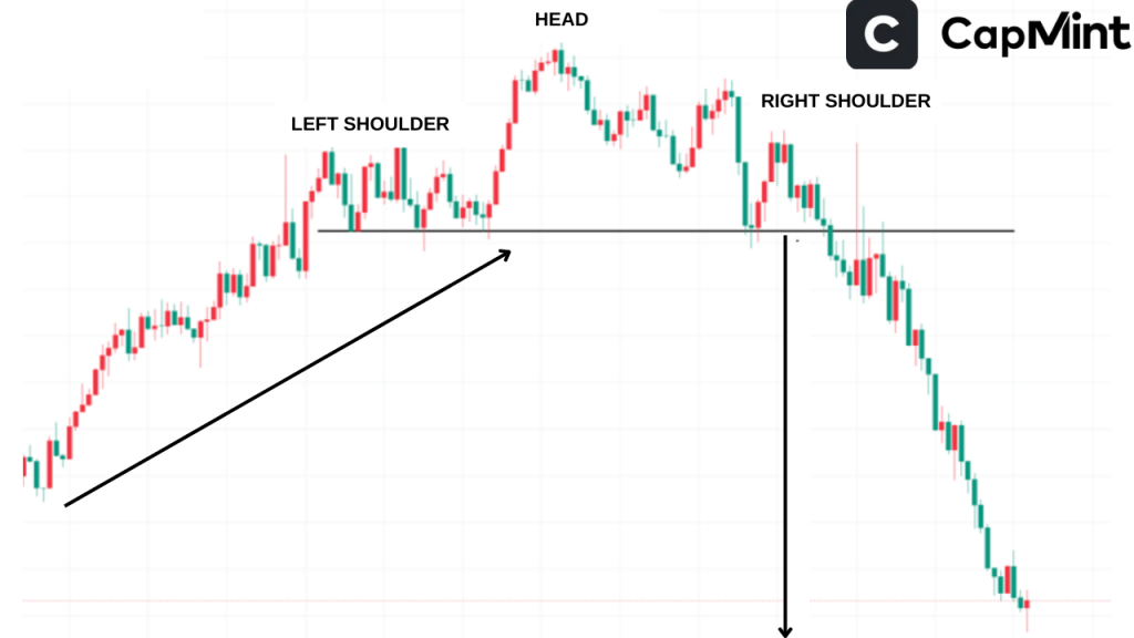
The pattern can take anywhere from a few weeks to several months to complete on daily charts, and the longer the formation period, the more significant the eventual breakdown tends to be. A common mistake is identifying an incomplete head and shoulders prematurely, before the right shoulder has fully formed, which leads to early entries that get stopped out if the uptrend resumes.
Double Top and Double Bottom
These patterns signal trend reversals. A double top suggests a bearish reversal, while a double bottom indicates a bullish reversal.
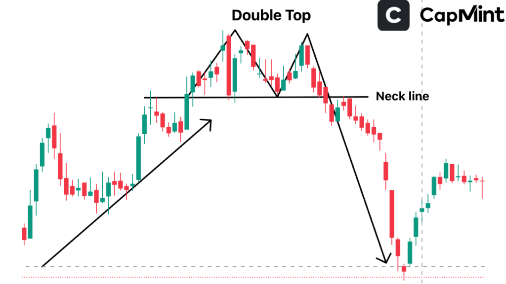
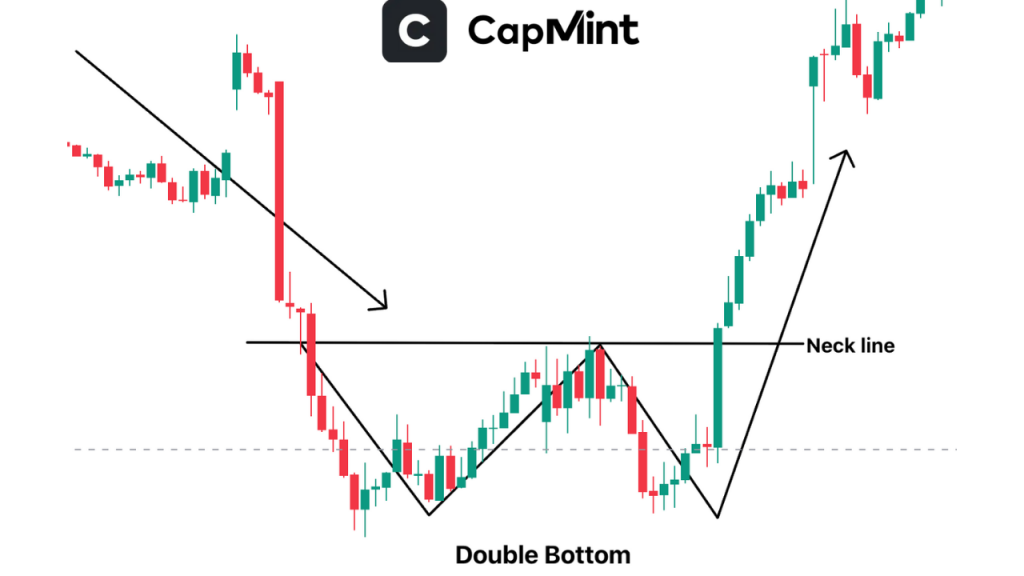
The two peaks in a double top (or two troughs in a double bottom) don’t need to be at the exact same price. A difference of 1–2% between the two levels is common in practice, and the pattern remains valid as long as the price clearly fails to break above (or below) the prior extreme. On liquid Indian large-caps, double bottoms at well-known support levels, such as the 200-day moving average, tend to attract noticeable buying interest, which can improve the pattern’s reliability.
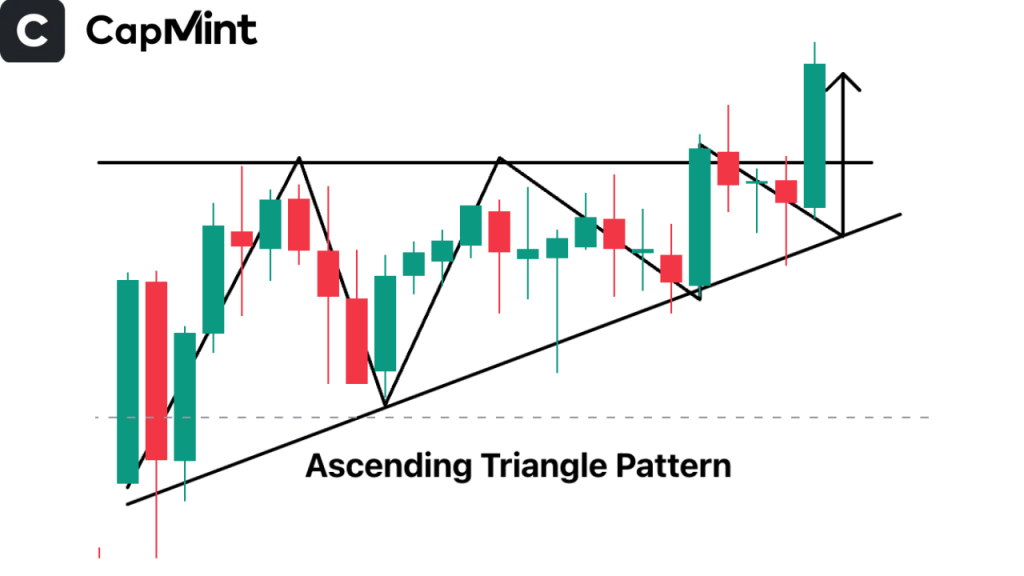
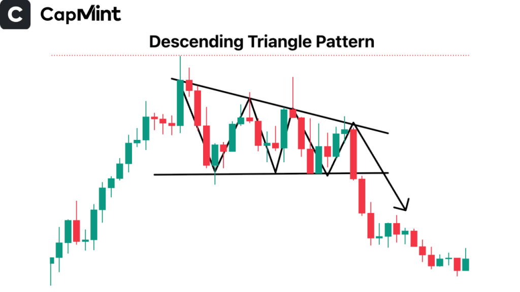
Triangles
Ascending Triangle: Bullish pattern with a flat upper trendline and rising lower trendline.
Descending Triangle: Bearish pattern with a flat lower trendline and descending upper trendline.
Symmetrical Triangle: Indicates indecision; breakout can occur in either direction.
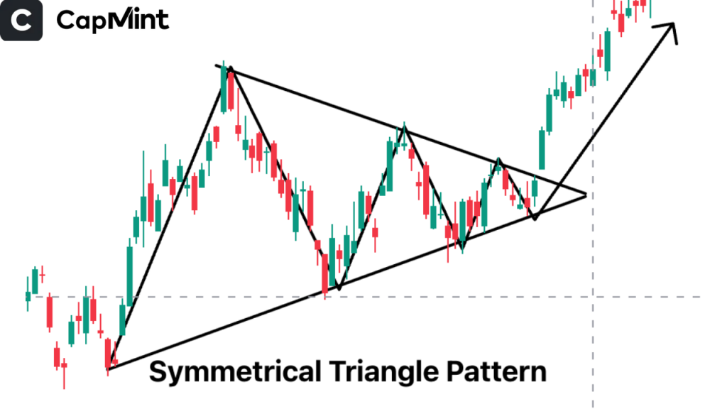
Triangles are among the most frequently occurring patterns on Indian stock charts, particularly during periods of consolidation after a strong trending move. One practical consideration: the breakout from a triangle is most reliable when it occurs roughly two-thirds to three-quarters of the way through the triangle’s formation. Breakouts that happen too close to the apex of the triangle, where the two trendlines nearly converge, tend to produce weaker follow-through moves.
Cup and Handle
A bullish continuation pattern resembling a tea cup. The “cup” forms a rounded bottom, and the “handle” forms a small consolidation before breakout.
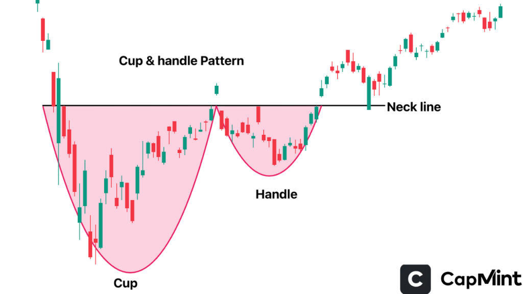
The cup portion typically takes several weeks to a few months to form, and the handle should ideally retrace no more than one-third to one-half of the cup’s depth. A handle that retraces too deeply into the cup suggests that the consolidation is losing its constructive character, and the breakout, if it occurs, may lack momentum. Volume should ideally decline during the handle formation and expand on the breakout above the handle’s resistance.
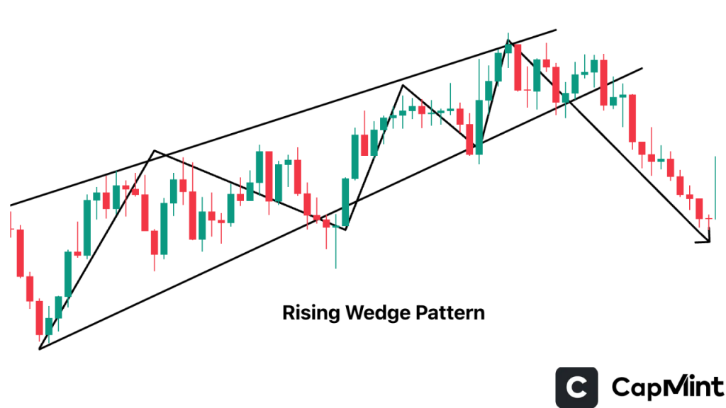
Wedges
Wedges are diagonal patterns that signal a potential reversal depending on the direction of the breakout and trend.
Rising Wedge: Bearish reversal pattern that forms as prices make higher highs and higher lows with decreasing momentum.
Falling Wedge: Bullish reversal pattern indicating a downtrend losing strength, often leading to an upward breakout.
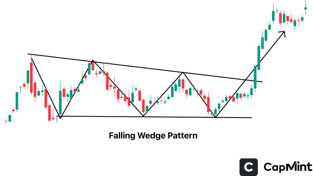
A subtle but important detail with wedge patterns: the converging trendlines should have at least two to three clear touch points on each side for the pattern to be considered well-defined. A wedge drawn through only one touch on the upper trendline and two on the lower is structurally weak and more prone to false breakouts.
Rounding Bottom
A long-term reversal pattern indicating a gradual shift from bearish to bullish sentiment.
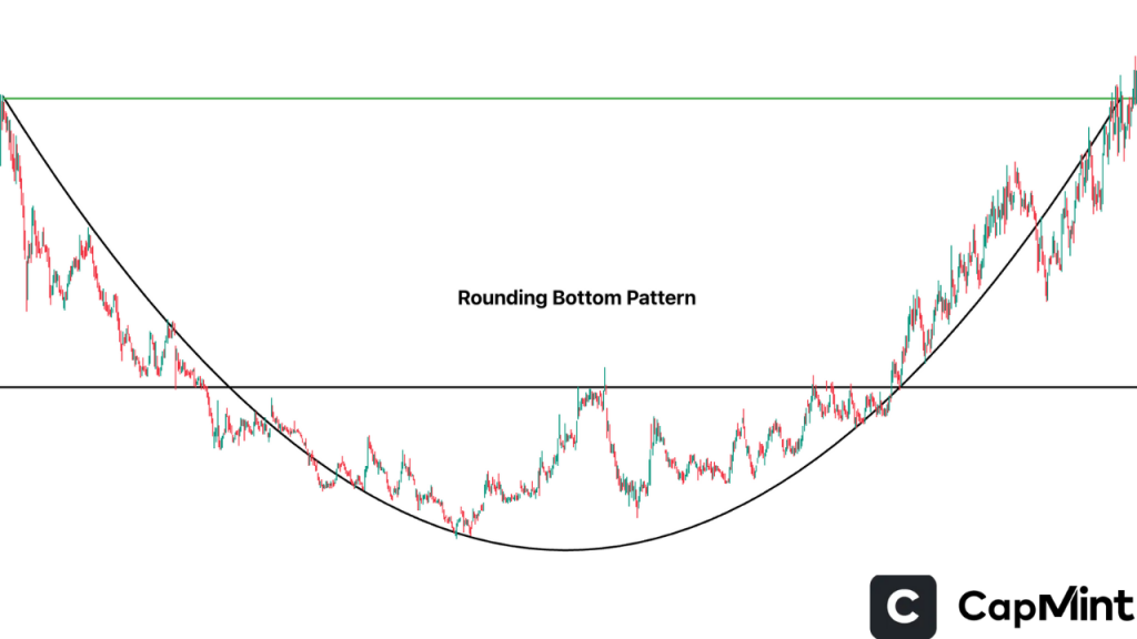
This pattern develops over an extended period, often several months on daily charts, and is characterised by a smooth, U-shaped price curve rather than a sharp V-shaped recovery. The gradual nature of the formation reflects a slow change in market sentiment, and the breakout typically occurs on expanding volume as the price clears the resistance level established at the pattern’s left rim. Because of its slow formation, the rounding bottom often goes unnoticed until it is well advanced, which can actually work in a trader’s favour since the pattern is less crowded with early entries.
Rectangle
A consolidation pattern where price moves within a horizontal range before breaking out in either direction.
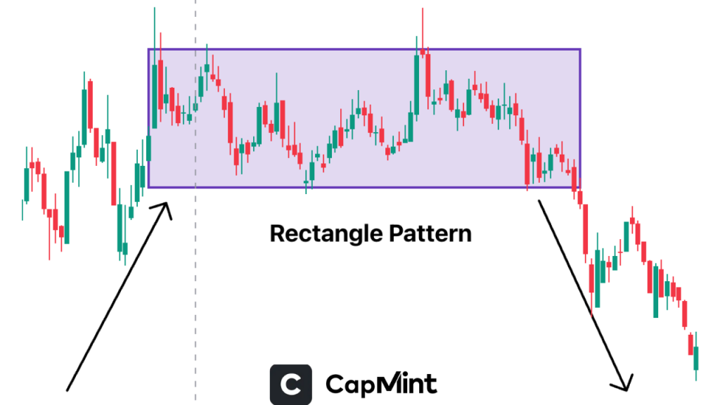
Rectangles are among the simplest patterns to identify, as they consist of clearly defined horizontal support and resistance boundaries. The pattern becomes more significant the more times the price bounces between these boundaries. A rectangle with four or five touches on each side over several weeks represents genuine consolidation, whereas a narrow two-bounce range may simply be a brief pause rather than a meaningful pattern. On Nifty 50 stocks, rectangles often form after earnings-driven gaps, as the market digests the new information before choosing a direction.
How to Use Chart Patterns in Trading
Using chart patterns can help you identify trends and trend shifts, but combining them with additional tools can strengthen your conviction. A few ways in which this can be done are mentioned below:
Validate the Trend with Volume
Volume usually jumps around breakouts. A valid breakout or breakdown will often see spikes in volume at key support or resistance levels, which strengthens the signal. A useful benchmark is to look for volume on the breakout day that is at least 1.5 to 2 times the 20-day average volume. Breakouts on below-average volume frequently reverse within one to two sessions.
Also, read about the volume in trading.
Confirm Breakouts and Breakdowns with Support and Resistance
Breakouts above resistance and breakdowns below support confirm the pattern. They act as barriers and provide accompanying entry and exit signals. After a breakout, the prior resistance level often acts as new support on a retest, and this retest can offer a lower-risk entry point for traders who missed the initial move.
Apply with Other Indicators
Using indicators like RSI, Moving Average Convergence Divergence (MACD), and moving averages provides additional certainty. An RSI divergence indicates that trends in play can change, and MACD crossovers aid in reinforcing the direction of the trend. For example, a head and shoulders pattern where RSI is showing bearish divergence on the right shoulder, declining even as price makes a comparable high, provides stronger conviction than the price pattern alone.
Look at the Timeframe
Patterns on longer timeframes are generally more reliable. Swing and position traders will find daily and weekly charts smoother and more stable compared to intraday charts laden with noise. A double bottom on a weekly chart of a Nifty 50 stock carries significantly more weight than the same pattern on a 15-minute chart, where random fluctuations routinely produce formations that resemble textbook patterns but lack follow-through.
Common Mistakes to Avoid in Stock Chart Patterns
Forcing Patterns Where None Exist
One of the most frequent mistakes traders make is seeing patterns that aren’t truly there. This can lead to false signals and poor trades. Always ensure the pattern has formed completely and matches the established criteria. A helpful discipline is to ask whether someone unfamiliar with the stock would independently identify the same pattern on the chart. If the pattern is only visible because you’re looking for it, it probably isn’t there.
Ignoring Volume Confirmation
Volume is critical in validating a pattern. A breakout without increased volume often lacks conviction and may result in a failed move. Always look for a volume spike to confirm strength. This is especially important on Indian mid-cap and small-cap stocks, where low-volume breakouts are more common and frequently trap traders who enter on the price signal alone without checking participation levels.
Trading Without a Defined Stop-Loss
Without a stop-loss, you’re exposing yourself to unlimited risk. Every trade should include a pre-determined exit strategy to protect capital in case the market moves against you. For chart pattern trades, the stop-loss should be placed at the level where the pattern is invalidated, such as below the neckline of a head and shoulders or below the lower boundary of a rectangle, not at an arbitrary percentage from entry.
Relying Solely on Patterns Without Understanding the Context
Patterns should never be traded in isolation. Always consider the broader market trend, news events, and fundamental context. A pattern that works in one market condition may fail in another. A bullish cup and handle on an individual stock, for instance, is far less reliable if the broader Nifty is in a confirmed downtrend, as sector and index-level weakness tends to override individual stock patterns.
Chart Patterns vs Indicators: What’s Better?
Chart patterns help visualise price action and market psychology, showing you how traders are behaving and where the market might move. On the other hand, indicators like RSI, MACD, and moving averages use mathematical formulas to provide quantitative signals based on price, volume, and momentum.
While some traders prefer one over the other, the truth is they work best together.
Chart patterns give you the structure, while indicators give you the statistics. Using both allows you to cross-verify setups, confirm breakouts or reversals, and avoid false signals. For example, if a Double Bottom pattern is forming and the RSI shows bullish divergence, the trade setup becomes more reliable.
One practical consideration: when patterns and indicators conflict, such as a bullish breakout from a triangle while RSI is showing overbought divergence, it is usually better to wait rather than force a trade. Conflicting signals often resolve into choppy, range-bound price action that punishes early entries in either direction.
Ultimately, blending both approaches can enhance your trading confidence and improve decision-making, helping you enter trades with higher probability and precision.
Conclusion
Understanding chart patterns is a valuable skill for traders. When combined with sound risk management, technical indicators, and market context, these patterns can provide a solid foundation for making consistent, informed trades. They allow traders to anticipate potential moves, validate strategies, and refine their entries and exits. The real value lies in integrating chart patterns with other tools to create a comprehensive trading approach. As with any skill, consistent practice, backtesting against historical data, and regular review of past trades will help you recognise patterns faster and act with greater precision. The traders who benefit most from chart patterns are those who treat them as one input among several, not as standalone signals.
Frequently Asked Questions (FAQs)
What is the most reliable chart pattern?
The Head and Shoulders and Double Bottom patterns are widely considered among the most reliable, especially when backed by strong volume confirmation and a clear breakout direction. These patterns reflect major shifts in market sentiment and often precede significant trend reversals. That said, reliability also depends on the timeframe and market context. The same pattern on a weekly chart of a large-cap stock is inherently more dependable than on a 5-minute chart of a low-volume counter.
Can beginners use chart patterns effectively?
Yes, beginners can use chart patterns effectively if they dedicate time to practice and learn the basics. Starting with simpler patterns like double tops, double bottoms, and triangles before moving to more complex formations is a practical approach. Coupled with proper risk management, patience, and journaling trades, chart patterns can offer beginners a structured approach to trading.
Are chart patterns useful for intraday trading?
Yes. Short-term chart patterns like flags, pennants, and triangles form quickly and are applicable in intraday strategies. When combined with tight risk controls and fast execution, these patterns can offer multiple trade opportunities in a day. However, intraday patterns are noisier and produce more false signals than their daily chart counterparts, so stricter confirmation criteria and smaller position sizes are advisable.
Do chart patterns work in crypto and forex?
Yes. Chart patterns are universal and work across multiple markets, including stocks, cryptocurrency, and forex. Since patterns are based on human psychology, which remains consistent across markets, their applicability remains strong in these asset classes. In highly leveraged markets like forex and crypto, where volatility is more extreme, false breakouts tend to occur more frequently, making volume confirmation and stop-loss discipline even more critical.
Disclaimer: This content is for educational purposes only and does not constitute financial or investment advice. Investments in securities or other financial instruments are subject to market risk, including partial or total loss of capital. Past performance is not indicative of future results. Always consider your financial situation carefully and consult a licensed financial advisor before making investment or trading decisions.
Table of Content
- Key Takeaways
- What Are Chart Patterns?
- Why Chart Patterns Matter in Trading
- Different Types of Chart Patterns
- Most Popular Chart Patterns Explained
- How to Use Chart Patterns in Trading
- Common Mistakes to Avoid in Stock Chart Patterns
- Chart Patterns vs Indicators: What's Better?
- Conclusion
- Frequently Asked Questions (FAQs)
Engineered for the obsessed. Built for traders.

Purpose-built terminals.
Zero compromise.
Built for speed.
Plot No 1290, 2nd Floor, 17th Cross, 5th Main, Sector-7, HSR Layout, Bangalore 560102
Follow us on
Mintcap Brokers Private Limited
CIN – U66110KA2023PTC178706 | Registered Address: Plot No 1290, Second Floor, 17th Cross, 5th Main, Sector-7, HSR Layout, Bangalore 560102 | Tel: 080 – 49552310 | Email ID: compliance@capmint.com | SEBI registered Stock Broker: INZ000322732 | NSE Cash/F&O Member ID: 90430 | BSE Cash/F&O Member ID: 6903 | MCX Member ID: 57400 | NCDEX Member ID: 1312 | SEBI registered Depository Participant: IN-DP-806-2025 | CDSL DP ID: 12102300 | NSE Clearing Member code: M70108 | AMFI-Registered Mutual Fund Distributor: ARN-289109 (Valid upto 28-Feb-2027) | Category II Execution Only Platform : E6903
Details of Client Bank Account
Compliance Officer: Ms. Shridevi Vungarala | Email ID: compliance@capmint.com | Tel no. + 91 9035330126 | Grievance Redressal Officer (GRO) – Ms. Shikha Gupta | Email ID: Grievance@capmint.com | Tel no: 9035331595.
Procedure to file a complaint on SEBI SCORES: Register on SCORES portal. Mandatory details for filing complaints on SCORES: Name, PAN, Address, Mobile Number, E-mail ID. Benefits: Effective Communication, Speedy redressal of the grievances. You may refer the website https://scores.sebi.gov.in/ for more information. You may also download the SEBI Scores app to log a complaint Android: https://play.google.com > store > apps > sebiscores iOS: https://apps.apple.com > app > sebiscores
Disclaimer
Investment in the securities market are subject to market risks, read all the related documents carefully before investing. Brokerage will not exceed the SEBI prescribed limit.
Mutual fund investments are subject to market risks, read all scheme related documents carefully before investing. Mutual Funds are not exchange-traded products.
Attention Investor:
- Stock Brokers can accept securities as margin from clients only by way of pledge in the depository system w.e.f. September 1, 2020.
- Update your mobile number & email Id with your stock broker/depository participant and receive OTP directly from depository on your email id and/or mobile number to create pledge.
- Pay 20% as upfront margin of the transaction value to trade in cash market segment.
- Investors may please refer to the Exchange’s Frequently Asked Questions (FAQs) issued vide circular reference NSE/INSP/45191 dated July 31, 2020 and NSE/INSP/45534 dated August 31, 2020 and other guidelines issued from time to time in this regard.
- Check your Securities /MF/ Bonds in the consolidated account statement issued by NSDL/CDSL every month.