
Link copied!
Golden Cross Pattern
A Golden Cross is a bullish signal in technical analysis that occurs when a short-term moving average (like the 50-day) crosses above a long-term moving average (like the 200-day). It indicates a potential uptrend in the stock or market.
Key Takeaways
- A golden cross happens when a short-term moving average crosses above a long-term moving average, signalling a possible uptrend and increased buying pressure.
- It forms in three stages: the end of a downtrend, the crossover, and a continued uptrend where moving averages act as support.
- The golden cross is the opposite of the death cross, which signals a bearish trend. While both indicate trend changes, they usually confirm movements that have already started.
Golden Cross Pattern Explained
A golden cross is a chart pattern where a short-term moving average crosses above a longer-term moving average, signalling potential buying pressure in the market. It indicates a shift in momentum toward a bullish trend and is often seen as a sign of a potential breakout. Traders and investors consider this a buying opportunity, as it suggests increasing demand and the possibility of continued upward movement in the stock price.
Since long-term indicators are more reliable, a golden cross suggests the start of a long-term uptrend in the market. If trading volumes are high during this crossover, it strengthens the signal, increasing confidence in the bullish trend.
How Does A Golden Cross Form?
A golden cross is a momentum indicator that shows short-term prices are gaining strength. When a golden cross occurs, traders are shifting their outlook from bearish to bullish. This crossover happens in three stages, marking the transition from a downtrend to an uptrend.
The first stage happens when a downtrend reaches its lowest point, and buyers start gaining control over sellers. In the second stage, the short-term moving average moves above the long-term moving average, signalling a breakout and confirming that the downtrend is reversing.
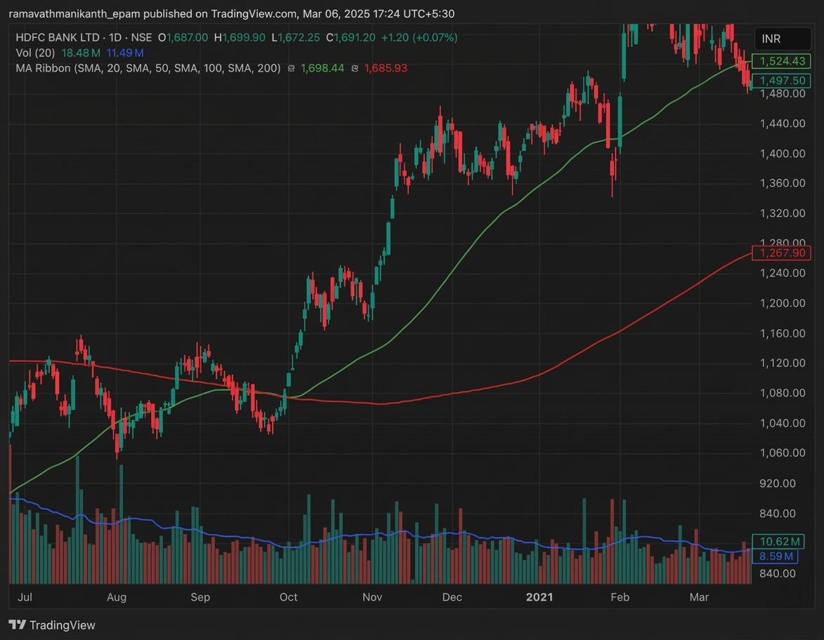
Here is an example of a Golden cross where the green line, 50-day moving average, crosses the red line, 200-day moving average, showing a bullish trend.
The final stage is when the uptrend continues after the crossover. The moving averages act as support, helping the price stay above them during small declines until they eventually cross back down, signalling a potential trend change.
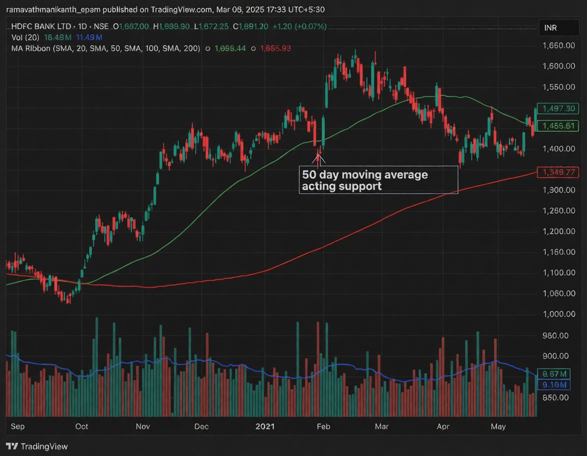
In the chart below, the 50-day moving average acts as a support level, helping the price stay above it. The price regained support for a while, but once the 50-day moving average was broken, the price lost momentum and started to decline.
The most commonly used moving averages in a golden cross are the 50-day and 200-day moving averages. Since these are long-term moving averages, they create stronger and more lasting breakouts when the crossover happens
Golden Crossover V/s Death Cross Over
A golden crossover is a bullish strategy, while a death crossover is its opposite, indicating a bearish trend. In a death crossover, a long-term moving average crosses above a shorter-term moving average, signalling that the price has lost momentum. This suggests that traders are shifting their outlook from bullish to bearish.
After the crossover, the long-term moving average acts as a key support level in a golden cross or a resistance level in a death cross. These crossovers can signal a trend change, but they usually appear after the trend has already started shifting.
Importance of the Golden Cross Candlestick Pattern
There are several reasons why the golden cross is considered an important technical indicator.
Trend Reversal Confirmation
The golden cross is widely seen as a strong signal of a long-term trend reversal, especially when supported by other technical indicators. It mainly helps confirm the end of a downtrend and the beginning of a new uptrend.
Market Sentiment Indicator
It reflects a shift in market sentiment. When the 50-day moving average crosses above the 200-day moving average, it indicates increasing buying pressure, suggesting growing optimism among market participants.
Widely Recognized
The golden cross is one of the most widely followed technical indicators. Since many traders and institutional investors track it, its occurrence often leads to increased buying activity, reinforcing its effectiveness.
Easy to Identify
As it is based on moving averages, the golden cross is simple to spot on charts. This makes it accessible and useful for both beginner and experienced traders.
Interpretation of Golden Cross Pattern
Although the golden cross is a strong indicator of a potential bullish move, it should always be analysed within the broader market context. Here’s how traders generally interpret it:
Bullish Signal
The golden cross occurs when the shorter 50-day SMA moves above the longer 200-day SMA, indicating that short-term momentum is strengthening and may develop into a sustained long-term uptrend.
Volume Confirmation
Traders often look at trading volumes alongside the golden cross to validate the signal. Higher volumes during the crossover strengthen its reliability and increase the chances of a sustained uptrend.
False Signals
In volatile or sideways markets, the golden cross can generate false signals. The crossover may quickly reverse into a death cross, resulting in unclear market direction and unreliable trends.
Conclusion
The golden cross is a technical indicator that signals a bullish trend when a short-term moving average crosses above a long-term moving average. It shows increasing buying pressure and a shift in market momentum. Traders use it to identify potential buying opportunities, especially when supported by high trading volume.
The golden cross forms in three stages: the end of a downtrend, the crossover, and a continued uptrend. It is the opposite of the death cross, which signals a bearish trend. While both indicate trend changes, they usually confirm existing movements. Understanding the golden cross helps traders make better investment decisions.
Frequently Asked Questions on Golden Cross Pattern
What is a golden cross?
A golden cross is a bullish signal that occurs when a short-term moving average crosses above a long-term moving average, usually the 50-day above the 200-day. It suggests potential upward momentum in a stock or index.
Is the golden cross a reliable indicator?
The golden cross is considered a strong bullish indicator, but it is not always reliable on its own. Market conditions, volume, and trend strength should be analysed alongside it to avoid false signals.
What’s the difference between a golden cross and a death cross?
A golden cross signals a potential uptrend when a short-term average moves above a long-term average. A death cross is the opposite, indicating a possible downtrend when the short-term average falls below the long-term average.
Can I trade based on the golden cross alone?
Relying only on the golden cross is risky. It is better to combine it with other indicators like volume, support and resistance, or RSI to confirm the trend and reduce the chances of false entries.
Does the golden cross work on all timeframes?
The golden cross can appear on different timeframes, but it is more reliable on longer timeframes, like daily or weekly charts. On shorter timeframes, signals can be frequent and less dependable due to market noise.
Disclaimer: This content is for educational purposes only and does not constitute financial or investment advice. Investments in securities or other financial instruments are subject to market risk, including partial or total loss of capital. Past performance is not indicative of future results. Always consider your financial situation carefully and consult a licensed financial advisor before making investment or trading decisions.
Engineered for the obsessed. Built for traders.

Purpose-built terminals.
Zero compromise.
Built for speed.
Plot No 1290, 2nd Floor, 17th Cross, 5th Main, Sector-7, HSR Layout, Bangalore 560102
Follow us on
Mintcap Brokers Private Limited
CIN – U66110KA2023PTC178706 | Registered Address: Plot No 1290, Second Floor, 17th Cross, 5th Main, Sector-7, HSR Layout, Bangalore 560102 | Tel: 080 – 49552310 | Email ID: compliance@capmint.com | SEBI registered Stock Broker: INZ000322732 | NSE Cash/F&O Member ID: 90430 | BSE Cash/F&O Member ID: 6903 | MCX Member ID: 57400 | NCDEX Member ID: 1312 | SEBI registered Depository Participant: IN-DP-806-2025 | CDSL DP ID: 12102300 | NSE Clearing Member code: M70108 | AMFI-Registered Mutual Fund Distributor: ARN-289109 (Valid upto 28-Feb-2027) | Category II Execution Only Platform : E6903
Details of Client Bank Account
Compliance Officer: Ms. Shridevi Vungarala | Email ID: compliance@capmint.com | Tel no. + 91 9035330126 | Grievance Redressal Officer (GRO) – Ms. Shikha Gupta | Email ID: Grievance@capmint.com | Tel no: 9035331595.
Procedure to file a complaint on SEBI SCORES: Register on SCORES portal. Mandatory details for filing complaints on SCORES: Name, PAN, Address, Mobile Number, E-mail ID. Benefits: Effective Communication, Speedy redressal of the grievances. You may refer the website https://scores.sebi.gov.in/ for more information. You may also download the SEBI Scores app to log a complaint Android: https://play.google.com > store > apps > sebiscores iOS: https://apps.apple.com > app > sebiscores
Disclaimer
Investment in the securities market are subject to market risks, read all the related documents carefully before investing. Brokerage will not exceed the SEBI prescribed limit.
Mutual fund investments are subject to market risks, read all scheme related documents carefully before investing. Mutual Funds are not exchange-traded products.
Attention Investor:
- Stock Brokers can accept securities as margin from clients only by way of pledge in the depository system w.e.f. September 1, 2020.
- Update your mobile number & email Id with your stock broker/depository participant and receive OTP directly from depository on your email id and/or mobile number to create pledge.
- Pay 20% as upfront margin of the transaction value to trade in cash market segment.
- Investors may please refer to the Exchange’s Frequently Asked Questions (FAQs) issued vide circular reference NSE/INSP/45191 dated July 31, 2020 and NSE/INSP/45534 dated August 31, 2020 and other guidelines issued from time to time in this regard.
- Check your Securities /MF/ Bonds in the consolidated account statement issued by NSDL/CDSL every month.